

Boarding Pass / Fail
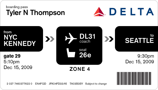
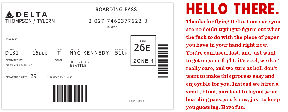 This is the actual boarding pass I got from Delta. It's a nightmare. Note all the random alignments and spacing issues.
This all started on a recent flight aboard a Delta Airlines plane. I was heading back from New York where I had met up with fellow designer Dustin Curtis. If you are not aware of Dustin's take on American Airlines, go read this. Anyway, I was inspired by Dustin and his attitude towards shittily designed things, to say the least. I was bored so I started rummaging through my stuff trying to find something to read when I grabbed my boarding pass. So I stared at it for a while. Rubbed my eyes, then stared at it some more.
It was like someone put on a blindfold, drank a fifth of whiskey, spun around 100 times, got kicked in the face by a mule (the person who designed this definitely has a mule living with them inside their house) and then just started puking numbers and letters onto the boarding pass at random (yes, I realize that a human didn't lay this out, if a human had, judging by the train-wreck of design, they would have surely used papyrus). There was nothing given size or color importance over anything else, it was a mess.
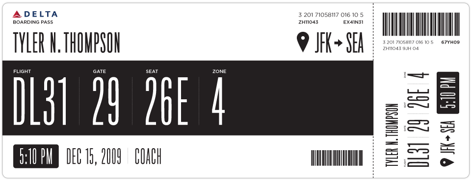
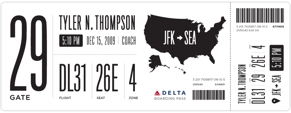
So I took out my Moleskine and started sketching. I tried to remember my previous trip through John F. Kennedy Airport and when and why I needed to reference my boarding pass. It seemed like I first needed to know which flight I was on. I put the gate right next to this, but made the flight number first because gates tend to change quite often. Next came my seat which I always look at a few times while boarding the plane. After that I put the zone, which is how they board the airplane initially and always seemed like the biggest cluster-fuck of people not knowing what zone they were in or how to find it on their pass. I also did something with the time I think might help, when it was a P.M. time, it was white text on a black box and when it was A.M. it was black text on a white box. Below is what I initially came up with.
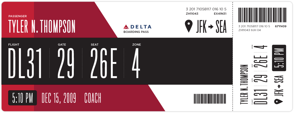
After looking at my initial design for a while I really wanted to add some color. This would be a great way to help add some branding and give some instant visual recognition of which carrier you are on.
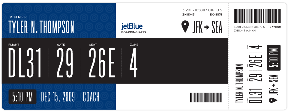
Once I added some branding I thought this layout could work for basically every airline. Below is Jetblue. I haven't researched many other boarding passes, international boarding passes etc. So please feel free to sprinkle the comments with any knowledge, insight etc on the issue.
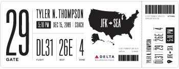
Here is another design I came up with as well.
If anyone has any ideas on how to make this better, please put together a design and email it to me here: t at squarespace dot com. If I get some interesting or good designs, I will update this post with them.
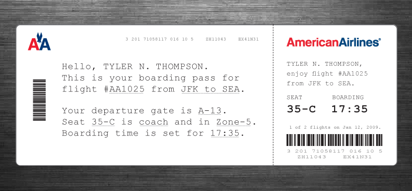
 Tyler Thompson
Here is an Illustrator file template with some of the elements and text, the fonts most likely wont come across unless you have them installed ( Titling Gothic and Gotham Book ) but it should help speed up mocking things up.
Tyler Thompson
A great point was brought up by Samuel about the fact that boarding passes are printed with thermal printers. This would, in effect, ruin the colored designs, although you can print one other color besides black via thermal printers, most commonly red. Here is some more info on thermal printers.
Tyler Thompson
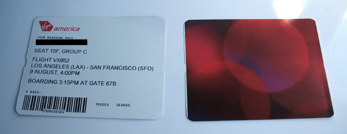
Here is a shot of a Virgin Airlines boarding pass. I would settle for an offset printed backside and a better thought out thermal printed front side.
Tyler Thompson
 Tyler Thompson
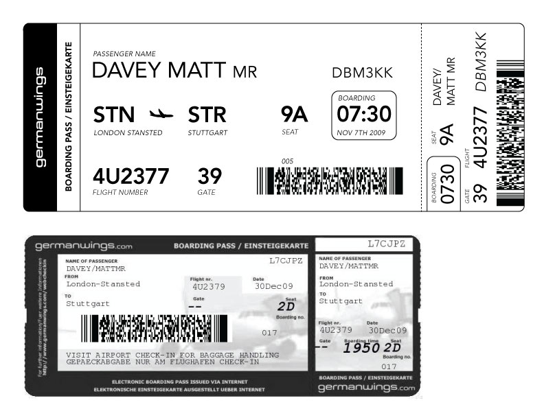
Matt Davey (@mattdavey) gives us our first foreign attempt. Apparently, foreign flights have huge ass barcodes. Nice and straight forward, thanks Matt. It's interesting to note that the foreign pass he shows has knocked out text on black and an image behind it. So either this isn't thermal printed or it is pre-printed then thermal printed.
 Tyler Thompson
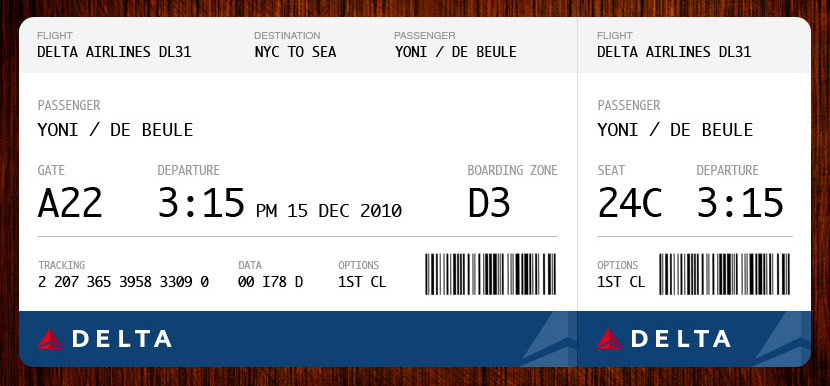
Yoni De Beule has compiled almost every point into this beautiful example. I think I would add the boarding time, but other than that, this looks great.
 Tyler Thompson
 Tyler Thompson
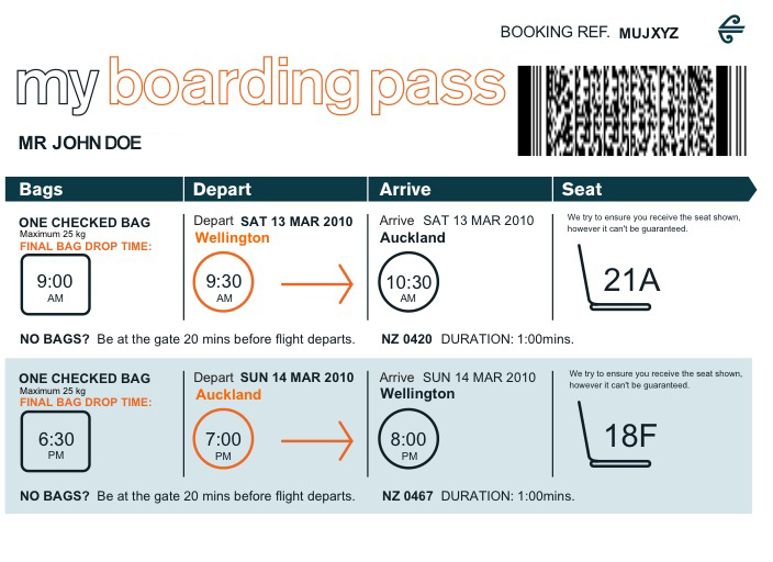
JJ sent this shot of a current Air New Zealand boarding pass.
Tyler Thompson
Great redesign by JJ at Graphicology (Squarespace site!). He takes into account the printing restrictions and adds a human touch. This is a really, really interesting approach.
Tyler Thompson
From Brent Gentile. He puts emphasis on the phonetics of your name and the airport codes. I think the phonetics part is important given the rich diversity of most airport travelers.
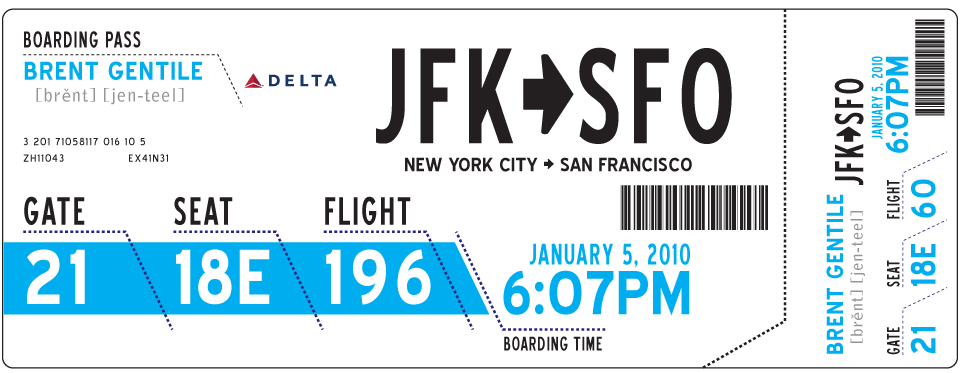
Tyler Thompson
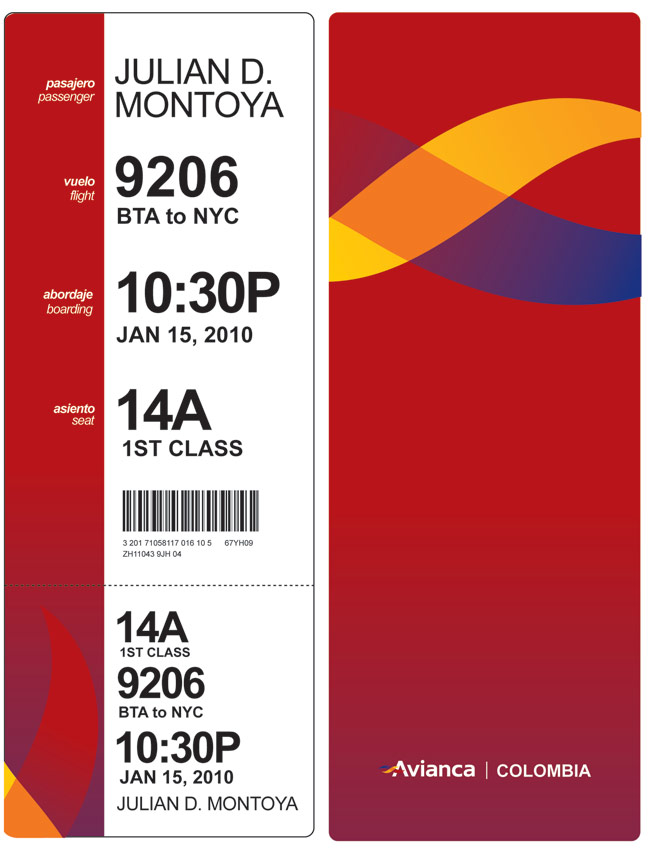
"Hi, I loved your blog about boarding passes, and here is my idea. You know, I think having a "vertical" orientation will give it a lot more clarity, like when you need to know quickly what a book is about, and you start reading from the top certain words. I tried to take the thermal printing into consideration when designing. "
- Julian Montoya
Tyler Thompson
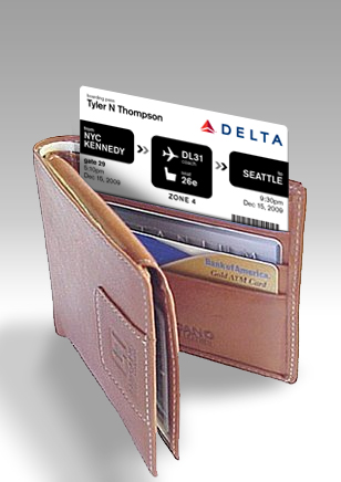
Wallet sized pass from Davin Yoon
Reader Comments (175)
Tyler my friend these look great, I think you have really nailed the most important bit of the large voucher for the passenger which is the gate number, you might want to turn your attention to the small stub the passenger retains at boarding and think of the focus there switching to the seat number. Perhaps there a greater focus on it would be the right way to go for that bit.
From the gate staff perspective on the large voucher again you have the focus of the flight number and the loading group or zone.
I think you are 90% there maybe just emphasizing a little more the gate and flight number and the zone on the large voucher and the seat number on the small stub and you are there.
Maybe moving away from the condensed font on those bits would help the emphasis.
Selfishly I'd love that zone number to be big as day so the gate staff can maybe spot those assholes who try to board early and boot them out of line.
Lovely designs, though little usability has been taken into account, as numbers are difficult to read and distinguish from others, format is rather not scannable for the eye, there's no ordering or hierarchy that guides the eye when browsing, and contrast (white text on black) not only renders the tickets rather expensive for what they are for, but also makes it more difficult to read.
I'm not saying ugly tickets are good, but boarding tickets should be first a readable scannable tool and then a canvas of beauty and good typography.
I love the designs. In the end though I think the airlines would probably go with the non-color based designs to save on ink.
@jason - Thanks, I had a lot of fun with these. I got your email / design, I will post it later today.
@victor - Any chance you want to back up your comment with a design :)
@justin - I am sure the airlines would never go for the color either, but it was worth a stab.
I think they would be fine with the color because they would be printing blanks beforehand anyway, how much more could a two color deal be at that point. Especially if its the same ink as a logo color.
love these designs.
one thought i had was how cool it'd be if the map of the US you have in the last example was actually a map of where you were flying to/from w/ arrows or dotted lines connecting the various cities.
@jason - Really good point. Their original example didn't have any color, but you are right, a huge pre printed 2 color run wouldn't be much more.
@chris - I actually tried something like that, but it seemed a little too small. But you should definitely try it yourself and shoot me a comp.
Rather than the US/world map, I think a small schematic of the airport showing the gate+concourse, and a small schematic of the plane showing the seat would be useful.
Simple and effective! A great example to show that less is more in a user-centered design ;)
A worthwhile exercise, but you've missed a critical point: boarding passes are printed on thermal printers, and need to be as inexpensive as possible. More black isn't an issue, as thermal printers don't use ink, but all the designs have the logo in color which would significantly raise cost-per-pass. Beyond that, I don't know a ton about thermal printing, but I'be surprised if it were possible to have large blocks of color on thermal paper. Size is also an issue; bigger passes = more paper = higher cost to the airline. The airlines are already struggling financially, so it would make sense to aim for a design that does a better job displaying necessary information in LESS space than the existing passes do.
I'm also in disagreement over some of the minor design decisions as well - the tall, narrow fonts of the original mockups are hard to read, the casing of the letters in the seat numbers is different than the casing on the actual plane, gate numbers are subject to change (and very, very often do) so making them the largest thing on the pass is probably not a good idea. Regardless of any nitpicks though, you definitely do have a good point. Boarding passes are HORRIBLY designed, and could definitely use an improvement. Thanks for making this post, and your original mockups. The more smart designers thinking about these kind of issues, the better.
@samuel - Thanks a lot for the great comment.
My main design ( the one with the black stripe across it ) was the one I thought was the most feasible in a actual real world scenario. I left plenty of room for the gate numbers to fluctuate and gave all the main information equal size and weight. The size was larger, but not bigger than some boarding passes I have gotten recently.
Again, thanks so much for the informative comment and feedback.
Very interesting. My biggest complaint is the fact that most of these examples list a time but don't say whether it's the boarding or departing time. Infrequent travelers are incapable enough at determining that they need to arrive at the gate early (I actually heard a passenger who had missed a flight say, "But this says my flight was at 12:55, and it's only 12:58!" as if that was a reasonable explanation). I think that the boarding time should be large, and the departing time should be smaller, but they each need to be on there and clearly marked.
In related design news, I can't see the far right side of the comment field, which is extremely annoying. I'm on Windows XP Pro / IE 6 (I'm at work - neither of those are my choice at home). I'm happy to send you a screenshot if you'd like.
I love the idea of maps on the boarding pass. International maps seem doable. A small glyph for each country with the airport codes on top of each outline – or below it.
And speaking of maps, it would be awesome to have a map of the terminals on the back of the pass with a star on the gate.
If you really want to get a grasp on airport issues, check out the reality series Airline. The first season is available on Netflix Instant Watch right now. Spoiler alert: like Margo said, people don't understand that the a "departure time" of 8:00PM doesn't actually mean be there at 8:00PM, rather that it means your plane is leaving at 8:00, be at the gate 40 minutes before. A be-at-the-gate time, or at least an obvious reminder on the boarding pass would go a long way.
Nice designs! But I'm pretty sure that the airlines care a whole lot more about saving money on printer ink than having a pleasing boarding pass design. Ink is one of the most expensive fluids on earth, and considering the volume of passengers, a little extra ink on the pass will end up multiplying to a lot of $. Not to mention when the printer runs out of ink more frequently, it takes the ability to print passes down while a person changes out the ink cartridges. Your designs probably use ten times the ink that the actual pass uses. Profit margins are razor-think in the air transport business, and I for one am glad they don't waste $$$ printing fancy boarding passes.
Great examples, I agree (unfortunately) that the colors would be a hard sell. One thing to keep in mind with the constant gate changes is that sometimes the airline personnel will write changes to flight information directly on the ticket, if the ticket is colored or too full it's not as extensible.
@Samuel, @Margo - Great point.
@Henry - I think maybe you are taking this the wrong way. Even if all they did was layout the shitty, flimsy little paper pass they originally gave me to better show the info, I would be very happy. I was just exploring what a pass might look like if the airlines were actually a profitable industry and they gave a shit about the experience of finding the plane you are supposed to be on.
Your designs are F*&*%ng genius - and your article is pretty hilarious too! I really think your designs would improve the way we travel. Way to go and I wish you the best 2010!
Cheryl Walters
Director of Communications
Spotlight Creative, LLC
Beautifully done, this is definitely going to catch some attention in the community. Digging the condensed typeface, also like the versatility of the designs and the idea of making all boarding passes standardized.
Awesome, Tyler!
Something else to consider, which I really hate, is the fact that many travellers who pre-register either bring-in their own inkjet print-out or print a page at a kiosk. In both instances, these pages are 8.5x11 and riddled with stupid ads, weather, etc.
These won't effect your design, but it was almost comical when boarding a month ago — seeing all these business travelers scanning these stupid, homemade pages at the gate.
You have to wonder how many hours, and how many repetitive questions, this would save the airport staff. An awesome reminder that design isn't just making stuff pretty, it's making stuff USEFUL. And pretty.
Awesome post!
I forgot how I came across this post, must have been via a tweet (thanks twitter for rendering my short term memory useless).
anyway, this very topic has been on my mind for a while. I remember having discussions a few designers and at the end we all came to a consensus that the cost of extra ink/emission/whatever you want to call it would come back to bite the customer in the ass.
Airline is a massive industry. It was American Airlines who saved millions of dollars by just reducing a single Olive from the main dish... this print job is no different. Frankly I'd rather do without a boarding pass all together and just have lines and directions on the ground that I can follow straight to my gate and straight to my plane and seat. (kind of like the showroom floors at Ikea) haha
As much as I love the ideas you've posted, I think they're still far too elaborate for this application.
Anyway, for your reference I'm attaching my summer British Airways boarding pass that I use as bookmark. BA definitely does a better job than Delta. http://bit.ly/8OvJIr
Love the work, Cheers!
I love the last idea, with the map. I agree, boarding passes are too boring. I flew between 8 airports since 2007. Here in Europe, each different airport issues it's own BP, regardless of the carrier. Between passes in Poland, Italy, Germany, Spain, England and Ireland, they only difference was the colour at the top and the airport's insignia at the back. However here, the bit you decided to remodel is removed by the cabin crew on boarding, and we're left with a stub. I'd like to work with you regarding this, you'd like?
I absolutely love these designs, and the idea of redesigning something that is a huge oversight in usability. Great job!
I wonder if rather than adding color to the front, instead use the backside as a branded airport/airline canvas, even just a 1-color.
I don't know about you but if the boarding pass is big enough I'll wind up suing it as a book mark. I will probably keep it for a few months until it gets to ratty to use. It makes sense to have a decent pass if it's something people are going to hang onto; even f your just chucking it tnto your wallet you'll come across it some day.
These are great, and the thinking behind them is even better. But as someone who studied engineering, and lived in Europe, I have to remark about the non-international nature of these. I'd change the date to a more universal, albeit, more sterile, format such as YYYYMMDD. The time MUST be 24-hour to accommodate international travelers and to avoid confusions. And in many countries, the passenger's last name is more important than the first (or middle.)
But that's not the point — the point is that we're challenging bad design in everyday applications and reinforcing how small changes can make big differences. We're fighting the philosophical war. We'll get there soon enough.
I love the designs, particularly the deep red. Also love the black only - saving the airline money on ink as well as making them look good! Well done.
This is a great exercise, and the redesign is certainly much needed. However, a certain percentage of boarding passes are still printed on card stock with a magstripe on the back, by what appears to be a 72-DPI dot matrix printer (I've got one of these passes on my desk right now). While it seems like the kiosk- and home-printed passes could easily be redesigned, I'm not sure how easy it would be to change the way these passes are printed.
I would fly more if these were the boarding passes...
Another cost to consider is the cost of the typeface(s) you've used. The original sample uses Verdana. You've used two families from H&FJ, which are gorgeous, but a hefty investment for a large company.
Just went and saw George Clooney in the Up in the Sky and had a visceral reaction to an opening shot in the airport.
Air travel seems predicated on making people miserable. The idea of designing a boarding pass that was people freiendly never crossed my mind.
Is that my own dullness as the culprit or am I just deadened to the idea that anyone at the airlines cares about the clients at all?
Great concept, though i have to say i really hate reading that font you've chosen. Bizarrely, it's easier to scan over the original boarding pass for the number you're looking for than it is on your redesigned one. Condensed fonts are a mortal readability sin. When i read the date for instance i feel like i need glasses. I shudder to think of the visually impaired.
I think it's a wonderful piece of work taken as a visual whole, but a boarding pass isn't a visual whole, it's a collection of data, the importance of which varies from passenger to staff. While I'm a big supporter of the Fuck-Yeah-2010-Where-Is-My-Visor-And-Hoverboard movement, i reckon some things don't need to be cool looking.
I guess this idea is in the air: A very interesting, very similar piece was in the new issue of McSweeney's. In it, Chip Kidd redesigns an Amtrak ticket.
In trying to find a link, the best I could do was a flickr photo.
I'm totally with you @Andreas. The condensed type is neat and all, but completely not practical. Boarding passes are for utility, not art. I do like the aesthetics of this redesigned boarding pass, but if it can't be read at a glance, it's no good to anybody except the barcode scanner. I see this all too often - let's make something so beautifully designed that it loses its purpose or usefulness completely. What this needs more than design is usability. </soapbox>
Great designs. One thing that you should find a way to highlight is the record locator, as this is used by the gate agent for various functions. The record locator is the six character string that uniquely identifies your information to the airline - in the scan of you Delta boarding pass this is the string "EN4FQD". The passenger doesn't care about this string most of the time, but the agents typically do and finding a way to make this visually distinct would help speed the customer's interactions with the gate agents... Thinking about it, the passenger will get asked for this number if they ever have to call the airline after they've been given a ticket... and if they have to call the airline after getting a ticket, the passenger is probably upset, so making the record locator easier to find for the passenger to find may help the passenger in a stressful situation.
outstanding!
I think this is a great exercise, although the ultimate solution is to get rid of the boarding passes altogether - something that is actually already happening with mobile barcodes. Still, you need something that will give people the info they need to quickly know where to go, and when. Keep up the great work!
These look great. If these were actual boarding passes, they would certainly add to my travel experience. They'd look a lot nicer in a scrapbook, too.
Absolutely. Take the visual garbage OUT. I hope they pick this up, pay you an unthinkable amount of money, and get their boarding passes (which are far more important than a corner store receipt but exhibit far less readability) whipped into shape.
This may be an annoying side-track, but what about those of us who print out our boarding passes at home? They often seem considerably different (based on my scans of the scrum at the boarding gates) than the ones provided by the airline kiosk. Is this because the web site from which I print my boarding pass is designed by a completely separate department than the people who design the kiosk-printed boarding passes?
The design issues are similarly fraught, either source. And the home-printed passes have the additional challenge of being easy to crumple, so that the bar code on them is often unreadable by the gate scanner. So whatever number the gate agent types in would have to be quite legible.
Excellent post and comments. Only wish this design intelligence could be put to use by an airline or two!
Interesting post, but I agree that you should look at home printed boarding passes. I don't fly often, but ALWAYS print my boarding passes prior to arriving at the airport.
Also, I think even your designs, while nice, aren't taking into account the amount it would cost simply in ink to make these changes. That huge black strip across the middle would never pass inspection with the bean counters.
I do think that your attempts are pretty, and look nice at a quick glance, but I do also (along with others here) question the true utility of the changes.
hmmm....while nice designs, i'd maybe bark about fixing some of the airlines' other problems - like security, old & wornout cabin ammenities and grouchy staff...tickets are the last wise marketing investment...visual branding, visual schmanding - every neighbourhood "missing dog" poster or "guitar for sale" ad doesn't need good typography/layout either...but hey - nice to see someone take issue with this...congrats!
Why be so arrogant in your criticism Tyler? You're not perfect and while your designs might be pretty they're not perfect either as is clear from some of the (more objective) comments here.
@everyone - Thanks for all the great feedback, examples, thoughts, insight etc. I realize that this little design experiment was more based on visuals than logistics.
@jen, @Andreas - Ok ok, I get it, Titling gothic is a bit hard to read, but it is so fucking beautiful and skinny.
@Mordy - You are so right. I would love to get rid of boarding passes all together, but until everyone has smart phones we are kind of stuck.
@Richard - Nothing is perfect. I am poking fun at the fact that boarding passes have been horribly neglected and overlooked. I started this article asking for help from the design community to help build the perfect boarding pass. My designs were neither perfect nor were they feasible in the real world, as it has shown from the comments. So how about this. Your comment, albeit it a shitty one, didn't contribute to this project at all, so how bout you drop some knowledge on my arrogant ass and design a fucking boarding pass for us all.
I was just thinking how ugly (and confusing) my boarding pass was the other day when flying home for Christmas!
I agree with some of the previous comments - non-condensed font - more scanability - one color and bam! You have a great functional design! Hopefully the airlines will be receptive to this (although i doubt it...)
-Niki Brown
http://nikibrown.com
I agree with most of the praise (aesthetics and user-friendliness) and criticism (practicality) others have already bestowed on your redesign. Lots of good points. And I am in no way a designer, but as a semi-frequent air traveler I have to say that a lot of the information and clutter on there is not easily dispensable. In your redesign you cut out the actual names of departure cities and destinations in favour for their airport codes. In theory this might work when travelers are familiar with codes, or when codes are pretty easily distinguishable (ie, JFK), but in reality I think this could cause more confusion than the original boarding pass. I can at least say from experience that on long-haul, multiple lay-over trips where I have been handed up to three boarding passes before getting on the first plane, that just relying on sometimes foreign international airport codes to distinguish between my passes would have been a supreme headache. T
Why not use icons with Gate number and seat numbers (instead of words "Gate" etc.)? The map could show locations of source and destination and directional arrow connecting them.
As Mordy Golding said, the future is mobile: flickr.com/photos/simon_aughton/4227319507/
I agree with Victor on many of his points, and to add to that, I think the order in which the information is displayed plays a key roll as well. I noticed that each ticket had varying degrees of order when concerning the flight number, zone, seat and gate number. As a user of airlines, I'm rarely concerned with the flight number, and in order of importance are the gate, followed by the zone, and lastly, the seat number. The seat is my last destination, so I would think it should be the last thing in the order of information.
Another thing to think of, since you had comments around printing things on the back, what about a small map of the airport, showing "You Are Here" (Ticket counter) and then a location pointer of where the gate is located. Just a thought.
Outside of that, I really love this exploration. I'm glad people are thinking more and more about the stuff in our world that's poorly designed.
I'm not sure I understand what's wrong with the Virgin America boarding pass. It tells you everything you need to know and nothing you don't. I guess they could move the boarding time/gate to the top, but other than that it's great.