

Boarding Pass / Fail
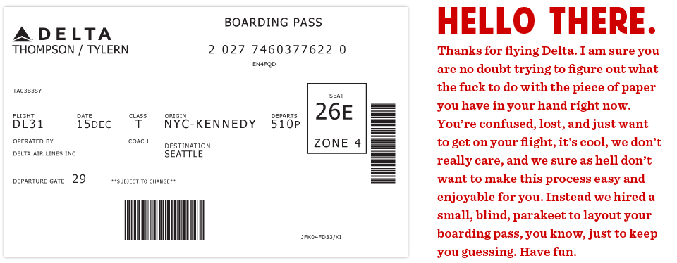 This is the actual boarding pass I got from Delta. It's a nightmare. Note all the random alignments and spacing issues.
This all started on a recent flight aboard a Delta Airlines plane. I was heading back from New York where I had met up with fellow designer Dustin Curtis. If you are not aware of Dustin's take on American Airlines, go read this. Anyway, I was inspired by Dustin and his attitude towards shittily designed things, to say the least. I was bored so I started rummaging through my stuff trying to find something to read when I grabbed my boarding pass. So I stared at it for a while. Rubbed my eyes, then stared at it some more.
It was like someone put on a blindfold, drank a fifth of whiskey, spun around 100 times, got kicked in the face by a mule (the person who designed this definitely has a mule living with them inside their house) and then just started puking numbers and letters onto the boarding pass at random (yes, I realize that a human didn't lay this out, if a human had, judging by the train-wreck of design, they would have surely used papyrus). There was nothing given size or color importance over anything else, it was a mess.
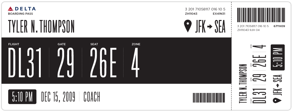
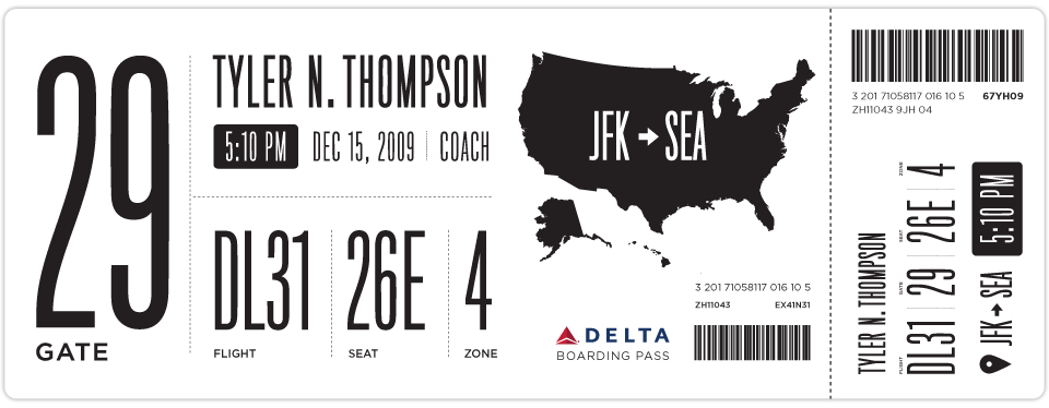
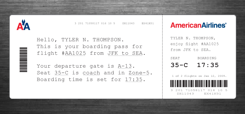
So I took out my Moleskine and started sketching. I tried to remember my previous trip through John F. Kennedy Airport and when and why I needed to reference my boarding pass. It seemed like I first needed to know which flight I was on. I put the gate right next to this, but made the flight number first because gates tend to change quite often. Next came my seat which I always look at a few times while boarding the plane. After that I put the zone, which is how they board the airplane initially and always seemed like the biggest cluster-fuck of people not knowing what zone they were in or how to find it on their pass. I also did something with the time I think might help, when it was a P.M. time, it was white text on a black box and when it was A.M. it was black text on a white box. Below is what I initially came up with.
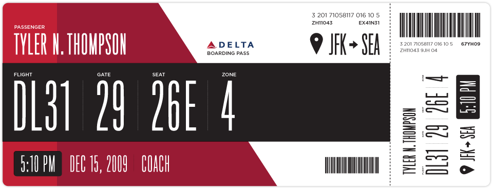
After looking at my initial design for a while I really wanted to add some color. This would be a great way to help add some branding and give some instant visual recognition of which carrier you are on.
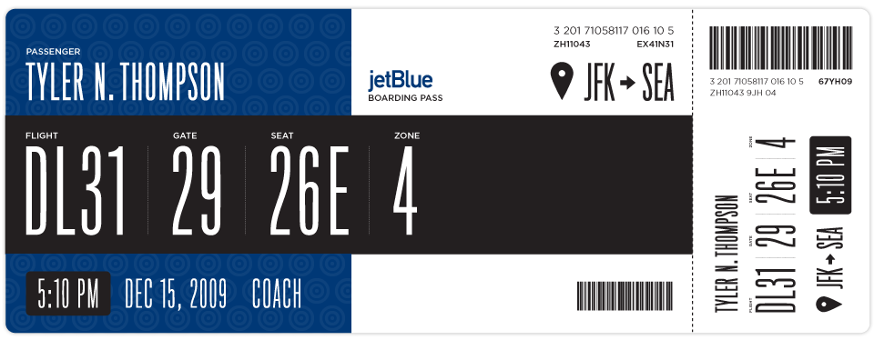
Once I added some branding I thought this layout could work for basically every airline. Below is Jetblue. I haven't researched many other boarding passes, international boarding passes etc. So please feel free to sprinkle the comments with any knowledge, insight etc on the issue.
Here is another design I came up with as well.
If anyone has any ideas on how to make this better, please put together a design and email it to me here: t at squarespace dot com. If I get some interesting or good designs, I will update this post with them.
 Tyler Thompson
Here is an Illustrator file template with some of the elements and text, the fonts most likely wont come across unless you have them installed ( Titling Gothic and Gotham Book ) but it should help speed up mocking things up.
Tyler Thompson
A great point was brought up by Samuel about the fact that boarding passes are printed with thermal printers. This would, in effect, ruin the colored designs, although you can print one other color besides black via thermal printers, most commonly red. Here is some more info on thermal printers.
Tyler Thompson
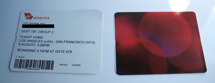
Here is a shot of a Virgin Airlines boarding pass. I would settle for an offset printed backside and a better thought out thermal printed front side.
Tyler Thompson
 Tyler Thompson
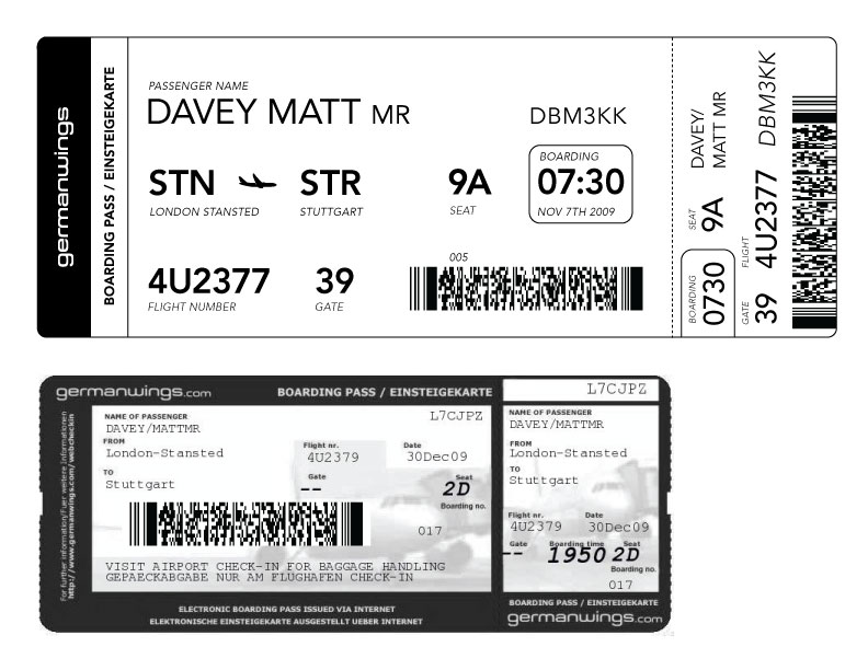
Matt Davey (@mattdavey) gives us our first foreign attempt. Apparently, foreign flights have huge ass barcodes. Nice and straight forward, thanks Matt. It's interesting to note that the foreign pass he shows has knocked out text on black and an image behind it. So either this isn't thermal printed or it is pre-printed then thermal printed.
 Tyler Thompson
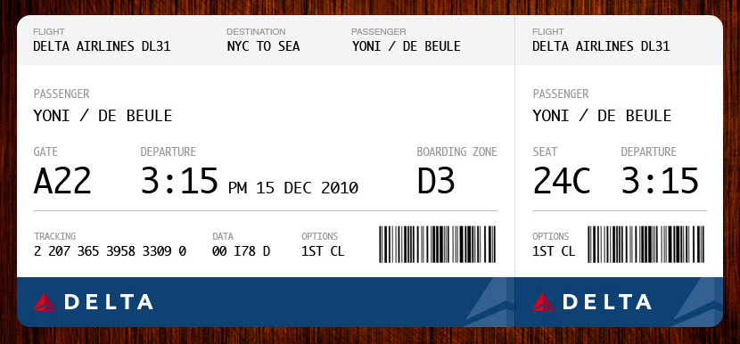
Yoni De Beule has compiled almost every point into this beautiful example. I think I would add the boarding time, but other than that, this looks great.
 Tyler Thompson
 Tyler Thompson
JJ sent this shot of a current Air New Zealand boarding pass.
Tyler Thompson
Great redesign by JJ at Graphicology (Squarespace site!). He takes into account the printing restrictions and adds a human touch. This is a really, really interesting approach.
Tyler Thompson
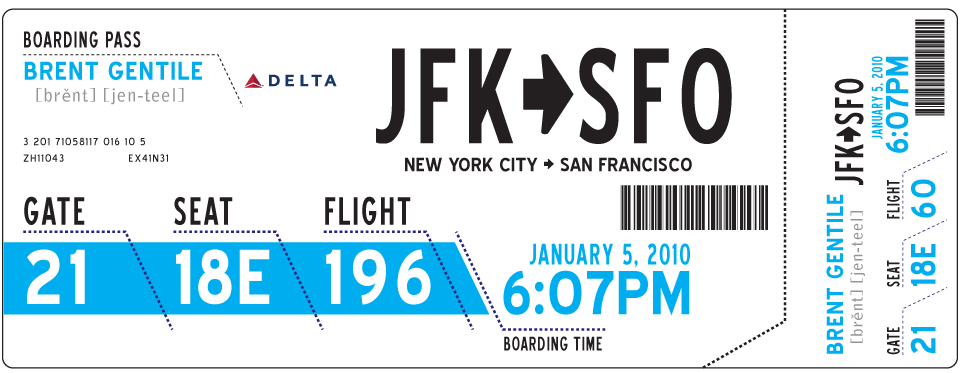
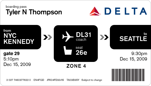
From Brent Gentile. He puts emphasis on the phonetics of your name and the airport codes. I think the phonetics part is important given the rich diversity of most airport travelers.
Tyler Thompson
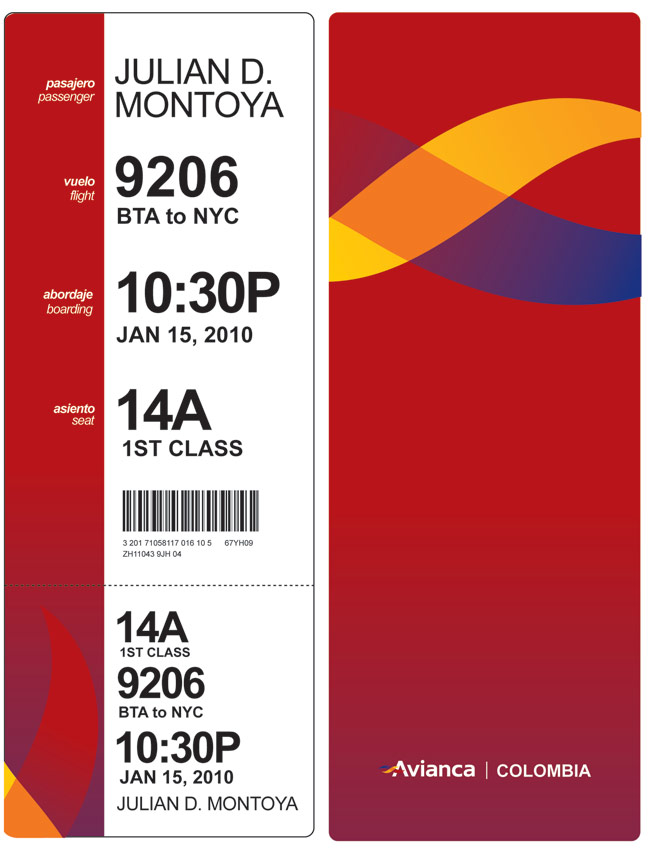
"Hi, I loved your blog about boarding passes, and here is my idea. You know, I think having a "vertical" orientation will give it a lot more clarity, like when you need to know quickly what a book is about, and you start reading from the top certain words. I tried to take the thermal printing into consideration when designing. "
- Julian Montoya
Tyler Thompson
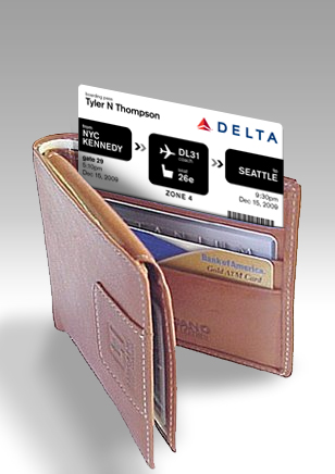
Wallet sized pass from Davin Yoon
Reader Comments (175)
@Aaron Richard - I love the Virgin America boarding pass, thats why I added the image of it. It is a great size and is right to the point. It looks like they print on some heavier stock and use a halfway decent font, considering the rest of the boarding passes out there.
Great exercise and a worthwhile attempt to start thinking about the overall traveling experience which has become an absolute nightmare. Kuddos to Tyler for starting this conversation. I do have to agree with Samuel's comments, there are a number of variables that prevent airlines from designing a better experience; gates change constantly based on airport traffic which have to contend with delays depending on other airports which in turn affect departure times which are affected by security protocols, we can go on and on. A "Wicked" problem indeed but we need to start somewhere.
Personally, I would love it if your passport was dual use and was your boarding pass too. It could be digital paper and when you book a flight it would update all the information to the digital paper in your passport so if gates changed etc, it would up to date and there would never be a need to print another boarding pass. Ahhh, the future.
I don't have the tools in front of me to do it right now, but take for example your JET Blue boarding pass...in the white area put a watermark picture of the city's skyline you're flying to. Or in stead of putting the map of the United States on the ticket, put a small diagram of the air plane you're getting on with a circle around the seat showing you where you're sitting - this could be put on the back of the ticket too I suppose.
If the airlines wanted to sell advertising space, they could offer Starbucks coupons (or whatever vendor?) on the back of the ticket to offset the increased cost of the ticket - for example: Buy a regular priced medium sized drink at the JFK Starbucks and receive 30% off your refill in Seattle - just present this coupon when you purchase both.
Really nice work. Amazing what can be achieved with thoughtful design. WRT to color, I don't think it's a problem. Half the boarding passes are printed at home/work prior to going to the airport. And airlines can get pre-printed ticket coupons with the colors prior to putting them through the thermal printer. Pretty inexpensive, especially if just 1-color process.
@ggruber66
It's... A boarding pass. It doesn't be a groundbreaking or captivating design, it has to tell you where you're going and then it gets thrown away. The current state (get it?) of the boarding pass is cost-effective and works just fine. Case closed.
"international boarding passes" - do you mean foreign boarding passes? As in, non-US ones? The world consists of more than the US and 'international'.
I must say, this was rather brave of you, to broadcast your ignorance and near-illiteracy to the world. I gleaned all the information necessary from that boarding pass in seconds, and have every time I've flown. If you really think it needs to be prettier, then you have too much time on your hands. I sure hope the airlines, all struggling to stay afloat, waste money and resources on this problem so next time I fly checked bags cost $10 more. If you need someone to spoonfeed you, hire a live-in nanny.
I love it when chicken shit trolls like Nelson, above, leave negative comments and then don't leave a link to who they are. Super classy nelson.
Again, like I said to another troll earlier in the comments, this is a positive exercise in the design of information. Nobody is claiming this will keep the airlines afloat or save anyone from them raising the cost of you checking your bags.
That being said, I love eating from spoons Nelson, so tell your mom to call me asap cause I am getting really tired of actually putting the spoon in my mouth all by myself.
I'll give you credit for leaving the comment up, but deduct points for the "your mom" joke. Shows the mentality of a person that has trouble comprehending shockingly straightforward information/instructions.
One thing I'd add to your design -- a "boarding time". Good work though!
I really enjoyed reading this post, as an air travel aficionado, as a graphic designer, as a font fan, and as a techie. You may or may not be aware that the unexciting and weirdly laid-out boarding pass design we labor with these days is mostly an artifact of the old system that printed the information on specific locations on punch-card stock, from the days when plane tickets were valuable documents printed by a travel agent or an airline, rather than flurries of electrons we could assemble on our own home printers.
Pretty much all of the machine-readable MICR text on boarding passes has been replaced by the bar codes (and, more recently, 2D dot codes) you used on your mockups, and there's little else left that would stop airlines from redesigning boarding passes to be whatever they needed them to be.
Enough other people, such as travelers and security agents, need to quickly scan boarding passes that this really ought to be a joint effort. Any one airline trying it would just create lots of confusion, even if their design in a vacuum were awesome and comprehensible.
Nothing you're suggesting or experimenting with would be impossible to implement, and I look forward to seeing progress along these lines in the not too distant future. Thanks for sharing your thoughts!
MHA
@Mark H. Anbinder - Thanks for the great comment / knowledge. I am really glad that this little exercise has roused so much insight into the process.
Nelson is handing out points and credits? If I knew that I would have worked a little harder coming up with some more: "would be nice if" ideas.
Perhaps the Airline industry wouldn't be in such trouble, if the experience they provided their customers was just slightly better than that of government. Oh and not bilking their customers for each piece of luggage they have with them would be a plus too. Advertising "We have great rates, come fly with us" and then charging an additional $50-$75 to take your clothes and computer with you is absurd. Its no wonder their businesses are failing. Oh and the genius who figured out that making the airplane 4 feet longer and squeezing 24 extra seats on board without adding any more baggage space should be as equally heralded as spoon-fed Nelson above who seems shockingly satisfied with straight-forward crap.
Tyler - You fucking ROCK. All of the haters that are making ridiculous comments can suck your dick. Fuck a spoon.
I was so visually satiated with the redesigned pass, and I too wish that people would invest much more design thought into MANY of our most important/used 'passes.'
And guess what guys, Tyler NEVER SAID ANYTHING about this being -THE- end all of boarding passes. He just offered his take on what he thought would be a nice redesign. That's it. I surely hope that all of you saying negative shit are soooo fucking on point in every area of your life that there's no room for admonishment.
(and no, I am not, nor do I know Tyler at all. I'm just a gal who HATES unnecessary negativity when people are trying to do something positive or creative.)
Tyler,
First off you noticed a horrible design decision that touches so many people and is far from personal. Secondly, your re-designs look amazing... I am really inspired by what you have done and created in this space. More-so, I am inspired by the fact that you made others create & respond with their creations. Thats awesome. Really good job.
BTW your footer is stellar.
Great exercise, Tyler, and all really good comments. This is something that definitely needs a re-design! I've seen boarding passes printed on both heavy stock and flimsy paper, both color (pre-printed, with thermal overlay) and b/w (thermal only). Knowing really nothing about the technical requirements of boarding passes, I'm guessing that their size requirements are dictated by printer style, paper style, and perhaps even a minimum size required so that passengers don't lose the pass.
If airlines are concerned about cost-saving measures on tickets, perhaps they might consider a co-marketing effort with a restaurant or coffee bar (you all know who I'm talking about here), that offers a coupon for the business on the back of the boarding pass stub (the part that the passenger keeps). Then the printing costs could be offset a bit. Concert tickets do this all the time. Maybe certain airlines do, too; I just haven't seen any recently.
so three things
first- i have to commend you for actually taking the time to do this. yes, there have been plenty of times when, i too, have wanted to scratch my eyes out, especially since once i actually misread my pass and went to the wrong gate. but i guess that nelson guy would label me as incompetent of reading a boarding pass.
so that brings me to the second thing- nelson. sorry, but i just laughed for so long at his comment. i don't think i need to say anything else.
third- while your boarding pass design is a great piece of work, i think the true piece of work on this site is your "Hi, if you are coming to this site via Internet Explorer 6" claimer thing. that was ridiculously hilarious. you have a natural gift for witty writing that'll even make anthony bourdain weep (he's not an author, he likes to eat. read his book "kitchen confidential" if this sounds confusing).
keep up the good work and perhaps find something else to improve and post?
Shut up, Richard.
Tyler,
Nice work! I did have a small cognitive dissonance moment though with one of the passes: looking at JFK --> SEA imposed on the map of the US just seemed off to me, given that JFK was on the Seattle side of the map and vice versa. Not saying that it doesn't make sense to keep the locations in FROM-TO order, just looked a bit odd in the example.
That said, your pass mockups are far easier to read than the mess that the airlines provide!
Boarding passes aren’t used only by passengers -- keep in mind that they are also used by airlines. A hundred thousand or more staff around the world (speakers of many languages natively written in many writing systems) are trained to recognize the data elements at a glance by standard positioning. There’s an elaborate and expensive installed infrastructure of printers and both optical and mag-stripe readers. Interline agreements make it invaluable for them to be standardized from airline to airline. And it’s essential to preserve backward compatibility with the old standards during any change (especially for the benefit of airlines without deep pockets to pay for a rapid change and the associated equipment.) The industry standards are set by IATA. Those of us old enough to remember the transition to the current ATB standard boarding pass format know how many years that took, with the so-called “transitional” formats remaining in use for about 20 years. *Customer* usability may have been short-changed in the last round of IATA standard-setting, but global technical standards and interoperability have huge benefits for travellers, weren’t easily achieved, and can’t easily be changed. Those who are treating this solely as a one-off graphic redesign job appear to be travellers unaware of the functional role of the boarding pass in the air travel business process.
I really like where you're going with these boarding pass designs, they have some real merit particularly on from a service design perspective.
There's one issue you need to revisit, which is the structure of the names. Boarding passes have the names printed specifically in a specific format (SURNAME/FIRSTNAME SALUTATION for those following at home) because this is the way information needs to be entered into airline computers to retrieve the information.
If airline staff have to re-construct how to enter the details into the system each time they're keying the details in, particularly at boarding gates if magstripe/barcode equipment fails, this adds unnecessary delays which can mount up. By formatting the name in the way it needs to be entered into the information system, this reduces the amount of thinking needed for airline staff to do their jobs.
So while presenting the name in another way might look very nice (and more professional too), the practicalities of this from a service design perspective suggest this should be left alone.
Also, to contribute to this I've uploaded an example of an international boarding pass for Qantas - and I personally think its well thought out. It may not be the best scan of the boarding pass, but the information has for the most part been cleanly structured. It also has the service information area on it for additional important messages, such as the passengers frequent flyer status and other important details (like the fact this ticket was an upgrade issued in the airline's lounge at Melbourne for example and I may not have catering allocated for me on the flight due to how close to departure time the ticket was upgraded).
Love to see if this Qantas boarding pass adds any new ideas to the mix or inspires you further.
RE the cost of ink. I fly Southwest frequently, so I'm used to the convenience of printing my own boarding pass (which includes a barcode). If ink is so expensive, airlines should encourage us to print our own boarding passes. The more attractive, the better.
It's just a boarding pass. Get over it.
Nothing wrong with the original Delta one at all. Very similar to the Qantas one we get there in oz. As long as it has your flight details and seat number, what else do you expect. Stop having a whinge bud. I think that there are more important issues in the world than this...
Great job Tyler - a worthy effort at transforming a mundane item into a more functional and aesthetic design. I admire the thought that went into the layout (both yours and @timoni), and agree that larger type would be very helpful both to passengers - the Baby Boomers are now in their 60's - as well as airline staff. I also really appreciate the concept of displaying both the boarding time as well as departure in timoni's mock-up. Many infrequent flyers need to be clearly instructed that the boarding process often starts 40+min prior to departure, yet only a few airlines print both, most just the latter. With respect to color, as others have said color is constrained by thermal, but it is possible to add color on the paper stock itself, many airlines currently do it this way.
I don't know if you're still iterating these, but in case you are I thought I'd add some feedback from a frequent traveler's perspective:
@adam is correct - the record locator code is very important and necessary for any itinerary changes. Ever been at a gate when they announce your flight is delayed by an hour? Everyone is suddenly very worried about their connection; half of them crowd up to the counter and the other half immediately get on their cell and call customer service!
@danielle also makes a very good point, only frequent travelers will be familiar with airport codes, city names are needed.
In addition, from a technical perspective there are some other key elements that have been left out in all of the designs above such as:
Fare/Booking Class - this is the "T" shown on your original Delta pass, and represents the type of fare you purchased, airlines track this very closely as it ties directly to their revenue management. When travel issues arise, airline agents will often be more accommodating to travelers in higher fare tiers in rebooking, etc.
Frequent Flyer# - It appears you don't have one for Delta (or at least it wasn't in your itinerary) but this is obviously very important to all of the mileage collectors as it helps to ensure they will receive appropriate credit. If it is not printed on the boarding pass, many folks will ask the gate agent to look into and verify - which takes up everyone's time.
Frequent Flyer status - Typically listed somewhere adjacent to the FF#, this designation entitles the elite (this is the airline's common term, not mine) travelers recognition. Security staff/TSA also verify status on the boarding passes for those who use the express security lines.
Not at all trying to be nitpicky here, just offering some input to a worthy cause. Keep it up!
Per what Ashi wrote - the fare class and frequent flyer information are v important for reasons already enumerated; it's also helpful for when the flight doesn't credit properly to your chosen FF program (for whatever reason). Having all these details on the boarding card stub makes it simple to prove that you were actually on that flight, booked in to whatever fare class and aren't trying to credit to more than one FF program.
Great post Tyler. I think the designs could take a bit more work, but a very interesting project. What next, sponsored ads on your boarding passes I guess which are designed for the individual destination and added to the pass by the printer? No doubt Google will be on-board soon!
Come on, if you're fit enough to travel alone (I'm looking at you, 16-year-olds) then you can read a boarding pass as printed now.
A boarding pass redesign would be just one more excuse for airlines to up their rates, but this time they'd have the excuse of R&D on a BOARDING PASS.
Tyler, some very well thought out designs. I'm usually a tough sell, but I honestly think I like each of your iterations. They are all certainly dramatic improvements from the passes being printed today. You do an excellent job of creating a visual hierarchy and prioritizing the key pieces of information that are important to the passenger.
Here's just an interesting thought. When you shop at some major retail stores like Target, if you ever have a question about the price of an item, you can simply pick up the product... take it over to a scanner mounted nearby and check the price yourself. There's no sticker shock at the register. IMAGINE if airports had similar terminals/stations for your boarding pass... you could just walk up to one of these screens, swipe your pass and get updated information about your flight. There's no need for 12-16 standard def TV's stacked together transitioning through pages of flight statuses... and there's no need to go wait in line to nag the gate attendant for a simple question.
So where does the SSSS go for people who have to go through extra security?
I love that last design: your boarding gate is your most important priority after the boarding pass is issued, so it should be the largest and left- or uppermost element on the pass. I would skip overlaying the to/from airport codes with the arrow over the US only because it may people think for a sec they're travelling from west to east. (Picky I know but ...)
what software do you use for your designing?
Dear Tyler
I loved reading this topic and it inspired me to make a design of my own. It uses the limitations and ideas explaned in Timoni Grone's post but combines it with more balanced typographics and pre-printed color graphics.
http://www.yonidebeule.be/lab/delta.jpg
Yoni De Beule
http://www.yonidebeule.be
"If ink is so expensive, airlines should encourage us to print our own boarding passes. The more attractive, the better." Infoshaman
This is a great idea, the airlines can give it an environmental friendly spin to the campaign, as well keep prices from rising.
Great post and great comps!
Great designs!
Tickets have 2 parts and each part should be designed for different problems:
1. First part is important till you go to the gate. So, the gate number, flight number and boarding time are most important information. But not the departure time.
2. Second small part that's teared off in the gate control is important just after you start walking to the airplane. So the seat number is the only important thing at this part. So it's enough to make it big and readeble.
I love the idea... design improvements make me smile. However, I think with some minor adjustments the current Delta ticket could work?
Paper tickets have been the standard for ever... you can fly, see concerts, go to games, plays, and monster truck competitions. Thinking out loud here.... For any event, I need to know three things. 1. The event/flight; 2. The date/time; 3. The venue/gate/seat. Bar codes, company codes and fine print, etc. although necessary should be contained in a tidy little space at the bottom or side. (boarding by zone is pointless IMO.... why not just board by row number?) The ticket should not be over designed. No fancy maps, or heavy typography. I kind of think that if you take the current typography and information and lay it out with a more natural flow, probably stack it/flush left that it would be successful (maybe not aesthetically, but as easy to navigate information)... Something most people need when they are being bombarded with the complexities of airport travel (signage, terminals, security check points, gate changes, announcements, luggage size, food, advertising...blah, blah). If the ticket is simple, the traveler will have one less thing worry about.
DELTA (logo)
THOMPSON/TYLERN
FLIGHT: DL31
ORIGIN: NYC-KENNEDY
DESTINATION: SEATTLE
DATE: DEC 15 2010
DEPARTURE TIME: 12:30 PM
GATE: C29
SEAT: 26E
BARCODE and all other coding off to the right side or bottom... or as spec'd by the electronic reader... and I don't understand what people don't understand about departure time... this is when the plane leaves, so better be there before then. If your sons football game starts at 1pm... I doubt you would miss the first half.
--for what it's worth.
I like the designs. Two thoughts/ideas:
1) You may have to sacrifice preprinted color, as the BPs are printed with either direct thermal or thermal transfer technology, depending on the printer. You can use colors but not in any area that will be printed with variable information.
2) How about finding some creative way to have the boarding info for a connecting flight on the same BP. Saves close to 50% of the paper and passengers hate having to shuffle multiple BPs. Delta uses a single bar for the entire record so the bar code would only have to be printed once. The sad thing is that NW used to do this, passengers loved it, but stubborn DL management didn't like it because it wasn't "the Delta way." (Idiots!)
Good work -- I think you've got something that Delta would want to see.
I think your first design is just perfect:)
Its suuuuperclear and looks also very luxury somehow. It feels like you are something special as a passenger when you get that pass.
I had that problem before, confusing flight passes, its horrible. I think airports are anyway extremly horrifying and confusing places when thinking that you miiight miss your flight that you CANT rebook....after you bought that expeeensive ticket what will make you have to live from almost nothing for the next 6 month. I also had this experience with the london metro......first they lead you with you with this coloured lines into the underground and then....nothing...once your down there...no information. just numbers and names on the trains instead of the coloured lines.
weeeeird....you feel trapped....:)
Interesting and amusing, and some good points all around. However, I also thought it was interesting that you focused on the "usability" aspect of the "design" -- I.e. you focused largely on the layout. The Virgin Airlines boarding pass is a bit too... (I am missing the perfect word here) for me, as is most of the hype stuff that they do to try to be hip. However, the genius of their pass is that its about the size of a wallet or cell phone, etc. In other words, it is pocket-sized. All the designs you posted retain the long bulky size of most of the current passes, and this provides some interesting *physical* usability problems -- you do have to carry the thing after all. Of course, as many have also eluded to, those darn airline companies are so stuck in their green-screen infrastructure reality with their money problems -- this issue will likely never be fixed. (remember press b-2-1-3-4-3-7-4-3-6-5 to access the edit seat assignment option ;-)
Here is my version and thoughts:
http://www.graphicology.com/blog/2010/1/11/280-a-practical-yet-human-boarding-pass-design.html
Love this post. Cheers,
JJ
I travel often and agree with the inane design of boarding passes. The mockups of the redesigns you post here are a vast improvement.
Did anyone consider including the destination arrival time? I find myself looking for that when arranging pickups/etc. (and calculating how delays impact arrival time)
Would be a good add.
Those look nice. As a very frequent traveler, the other thing you need to be sure to include is the airline status of the passenger. This is a must for frequent travelers as it gets attention and better service from gate agents and others but also helps other airlines within airline groups translate status. For example, American Airlines is part of oneworld which has its own 3 tiered status. You have to convert between AA's status to the oneworld status to figure out if you can get in international lounges. And, trust me, as a frequent traveler, the more your official ticket can shout, "hey, I'm a customer that gives you a lot of money," the better off the passenger will be.
I'd suggest a difference in focus
First the Boarding Time, then Gate, then the Zone, then finally the Seat - since this is the order you interact with them.
The flight number, date, location, etc can go together, for the most part they are immaterial and redundant (mere confirmation) unless your gate changes. Once I am at the airport and have been issued a ticket, I just want to check it is the right ticket and I am done with that info.
Manta's design is probably the best, although ink heavy. Also he forgot the seat number on the retained stub.
Nice JJ! I like you're solution. It solves many of the issues that I had with the "more designed" options on the original post. Your design keeps with the technology the airlines have and it presents the important information in a easy to follow language and format. And, thanks again to Tyler for creating this entertaining post.
These all look very nice and are certainly a drastic improvement over the current designs in use by the industry. My only comment, however, is in the form of a question:
When was the last time your ticket was actually ripped in half and you were given the detachable tab that is always present on these tickets?
I can't remember the last time that my ticket wasn't simply scanned and given back to me in its entirety. Perhaps not all airlines work this way, but in the last few years of flying I have yet to see it happen on my flights...
Justin,
The GA's (Gate Agents) have to tear that little part off if the electronic reader is broken for some reason, or if they have already closed the flight but you show up late (happened to me once or twice in the last 6 mos). After the flight leaves and things calm down, they manually enter all of the PAX (passengers) into the computer using the stubs. You retain the big portion of the BP to find your seat etc.
An analog backup (little stub part) is a perfect solution for such things.
Also, to everyone that says "Electronic passes" are the future. They *are* but not for at least 10 years. My prediction is that we'll see the # of electronic pass use continue to rise but I doubt we'll get rid of paper tickets in their entirety. How many people have non-smart mobile phones? Quite a lot. What happens if your phone breaks, or their little reader thing? How do you get on the flight?
Delta lets you scan your plastic SkyMiles Frequent Flier card in lieu of a paper ticket. This seems like a great option to me -- low tech, doesn't require fancy electronics (yes, I have an iPhone, but not everyone does). The problem is there still is not a good backup plan should the card reader fail in the boarding process. The GA still has to go back to my printed ticket.
The air lines want to load PAX ASAP and anything that requires lengthly look-ups or confirmations is not a good failure-mode option.
Not to mention, the TSA folks out front have a hard enough time dealing with all the different air line's BP. Throwing electronic ones in the mix would scramble their brains. :D
Tyler, and others who have made redesigns, is there a specific reason you keep the size the same?
The thing I hate the most in boarding passes is not that they are ugly, that'd probably be my last concern. A little layout improvement can be done, but I don't think it's like they are a cryptic disaster right now. Millions of people are able to use them every day :)
BUT- there is a big practical problem: they never fit completely in your pocket or passport because they're so big. The stub gets torn off and/or falls off... And you're not supposed to fold them not to make the barcode unreadable etc. Big hassle. I liked VA's boarding pass a lot because it was easy to keep in the passport.
I hope you guys focus on this too with further redesigns.
Also for mobile passes: there is no need for advanced smartphones. In Finland they SMS you your boarding pass (with the PNR in it) so you just show your phone at the gate. Helsinki airport also is probably is the calmest airport I've ever been to. That's the way to go! :)
I really like the ideas for re-design. The one thing that I think should be any of these passes in regards to origin and destination is the full name of the cities and the iata code.
Dear Tyler,
Thanks for the note and for the time spent on the designs for a new boarding pass. First, let’s cut to the chase and say that we agree to agree - we couldn’t agree more. The current Delta boarding pass has small print that makes it difficult for many of our customers to read and navigate. Secondly, I do have to defend our design team, made up of amazingly creative folks that hail from some of the best agencies and have worked for major corporations on brand name campaigns. This is definitely a case where function beat our form, much to the chagrin of our team. I’m not sure they liked being called blind parakeets, but all’s fair in love and blogging.
We'd like to let you know we are working on a boarding pass redesign. This will be delivered some time in 2010 but likely the customer won’t see it until closer to the end of the year. This is in part due to the final phases of our completed merger and also due to the logistics and technical impact of a boarding pass redesign. There are things that customers don’t see, and shouldn't have to be concerned with, but are things that need to be considered in the overall boarding pass design. For instance, we have varying types of hardware in 400+ Delta airports, printers with limited output quality, ie printing in color is not an option, varying paper stock, 2D barcode elements, multi-segments..etc. In addition, there are a lot of hidden fields that have other information that prints under certain circumstances - like operating carrier, special services and operational information for our agents. All these elements have to be included in order for the boarding pass to function when scanned at a kiosk, baggage drop position, security checkpoint, mobile handheld unit and boarding gate reader in addition to elements printed as a visual aid for employees processing the customer.
We will make you this commitment- this time around, we’ll try to ensure that form beats function and that our customers will be able to better view the information that is essential to their traveling needs.
Thanks again for your note and for your comments. And thank you to the other 87+ people who have submitted their comments and ideas. We’re listening.
Sincerely,
Tricia S.
Delta Air Lines, Inc.
Passenger Service Strategy, Technology & Alliances