

Boarding Pass / Fail
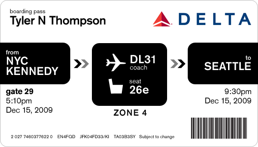
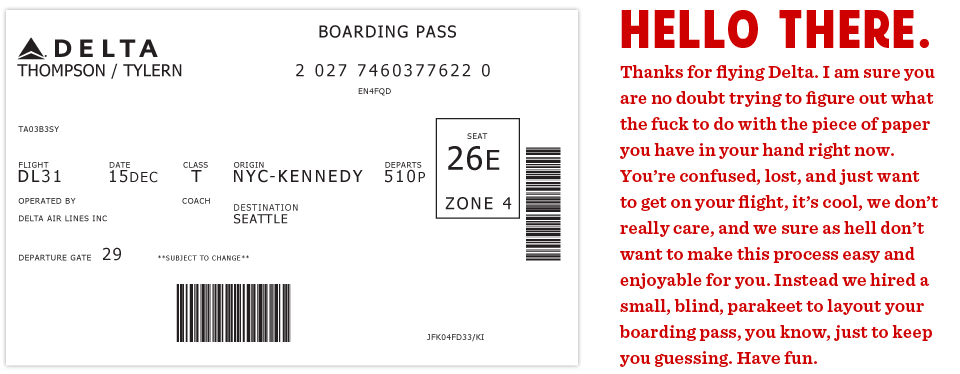 This is the actual boarding pass I got from Delta. It's a nightmare. Note all the random alignments and spacing issues.
This all started on a recent flight aboard a Delta Airlines plane. I was heading back from New York where I had met up with fellow designer Dustin Curtis. If you are not aware of Dustin's take on American Airlines, go read this. Anyway, I was inspired by Dustin and his attitude towards shittily designed things, to say the least. I was bored so I started rummaging through my stuff trying to find something to read when I grabbed my boarding pass. So I stared at it for a while. Rubbed my eyes, then stared at it some more.
It was like someone put on a blindfold, drank a fifth of whiskey, spun around 100 times, got kicked in the face by a mule (the person who designed this definitely has a mule living with them inside their house) and then just started puking numbers and letters onto the boarding pass at random (yes, I realize that a human didn't lay this out, if a human had, judging by the train-wreck of design, they would have surely used papyrus). There was nothing given size or color importance over anything else, it was a mess.
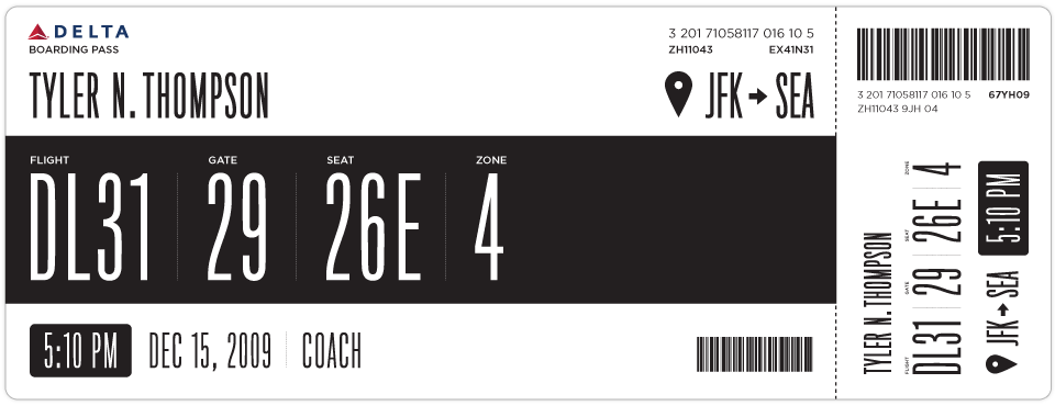
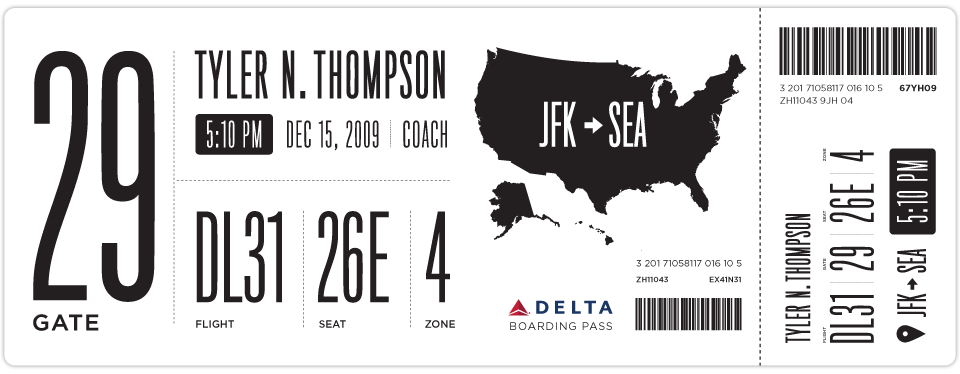
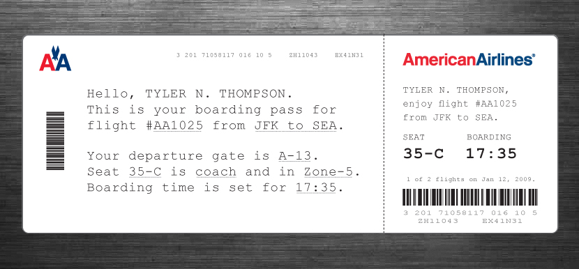
So I took out my Moleskine and started sketching. I tried to remember my previous trip through John F. Kennedy Airport and when and why I needed to reference my boarding pass. It seemed like I first needed to know which flight I was on. I put the gate right next to this, but made the flight number first because gates tend to change quite often. Next came my seat which I always look at a few times while boarding the plane. After that I put the zone, which is how they board the airplane initially and always seemed like the biggest cluster-fuck of people not knowing what zone they were in or how to find it on their pass. I also did something with the time I think might help, when it was a P.M. time, it was white text on a black box and when it was A.M. it was black text on a white box. Below is what I initially came up with.
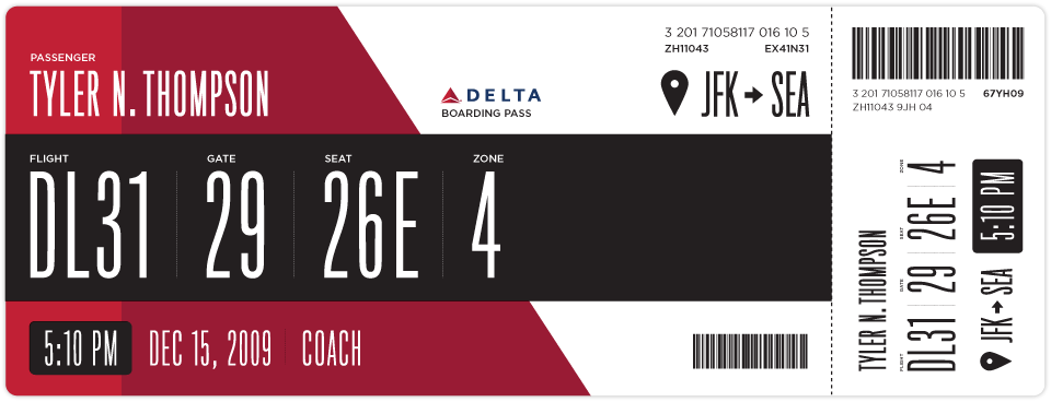
After looking at my initial design for a while I really wanted to add some color. This would be a great way to help add some branding and give some instant visual recognition of which carrier you are on.
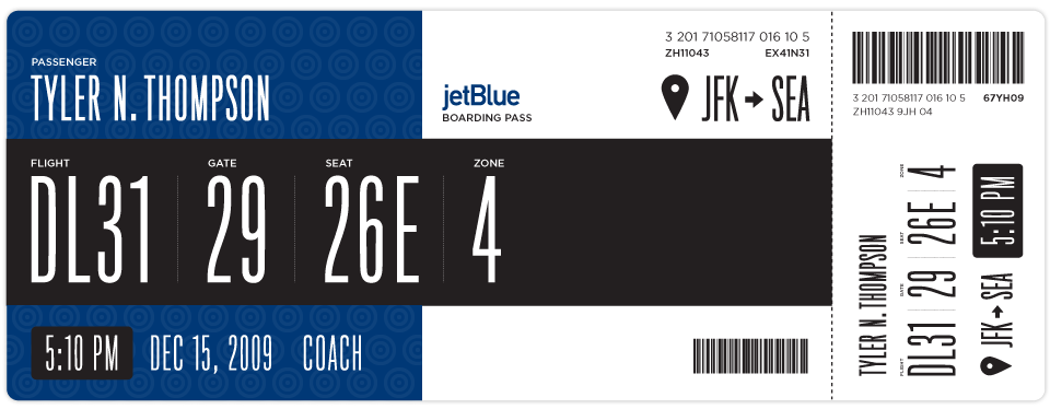
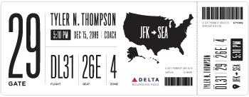
Once I added some branding I thought this layout could work for basically every airline. Below is Jetblue. I haven't researched many other boarding passes, international boarding passes etc. So please feel free to sprinkle the comments with any knowledge, insight etc on the issue.
Here is another design I came up with as well.
If anyone has any ideas on how to make this better, please put together a design and email it to me here: t at squarespace dot com. If I get some interesting or good designs, I will update this post with them.
 Tyler Thompson
Here is an Illustrator file template with some of the elements and text, the fonts most likely wont come across unless you have them installed ( Titling Gothic and Gotham Book ) but it should help speed up mocking things up.
Tyler Thompson
A great point was brought up by Samuel about the fact that boarding passes are printed with thermal printers. This would, in effect, ruin the colored designs, although you can print one other color besides black via thermal printers, most commonly red. Here is some more info on thermal printers.
Tyler Thompson
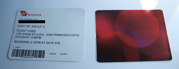
Here is a shot of a Virgin Airlines boarding pass. I would settle for an offset printed backside and a better thought out thermal printed front side.
Tyler Thompson
 Tyler Thompson
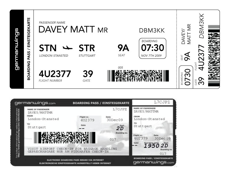
Matt Davey (@mattdavey) gives us our first foreign attempt. Apparently, foreign flights have huge ass barcodes. Nice and straight forward, thanks Matt. It's interesting to note that the foreign pass he shows has knocked out text on black and an image behind it. So either this isn't thermal printed or it is pre-printed then thermal printed.
 Tyler Thompson
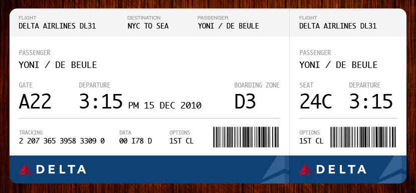
Yoni De Beule has compiled almost every point into this beautiful example. I think I would add the boarding time, but other than that, this looks great.
 Tyler Thompson
 Tyler Thompson
JJ sent this shot of a current Air New Zealand boarding pass.
Tyler Thompson
Great redesign by JJ at Graphicology (Squarespace site!). He takes into account the printing restrictions and adds a human touch. This is a really, really interesting approach.
Tyler Thompson
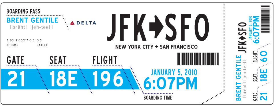
From Brent Gentile. He puts emphasis on the phonetics of your name and the airport codes. I think the phonetics part is important given the rich diversity of most airport travelers.
Tyler Thompson
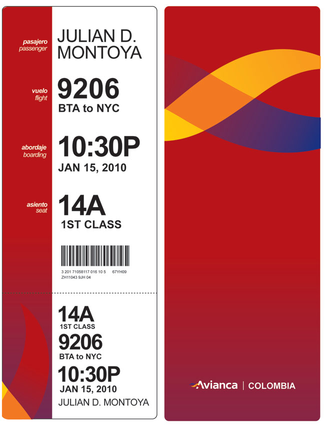
"Hi, I loved your blog about boarding passes, and here is my idea. You know, I think having a "vertical" orientation will give it a lot more clarity, like when you need to know quickly what a book is about, and you start reading from the top certain words. I tried to take the thermal printing into consideration when designing. "
- Julian Montoya
Tyler Thompson
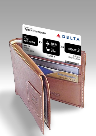
Wallet sized pass from Davin Yoon
Reader Comments (175)
Also given that the us airlines have always oversold my seat do I really need a boarding pass
perhaps they should be printed out on tissue paper,that way at leat I can wipe my arse with it
when I go to the toilet after being delayed 24 hrs.
Wonderful article, comments, and riffs on the theme. Amazing how we can put up with something for so long without thinking that there must be a better way. (Hey, maybe I could oil that squeaky door!) I got here from Russ Weakley's "[WSG Announce] Some links for light reading (19/01/10)," and I'm glad he included this article.
I am sending a link to my sister for its relevance to her work in safety, where poor design of checklists, instructions, signage, and so forth can have worse consequences than confusion and irritation. When I send links I always like to include Title, Author, Date, Link, and Comment/Synopsis. So I go to the top of this article looking for that information. "Hm, I wonder where he hides it?" Look up top, look at bottom, no luck. Scanning I recognize comment replies. Ah, there's the author, Oh, and yeah I remember now, of course, that's the name he used on the example boarding passes.
What about the date? Well, I guess I can again infer from the comments that it must have been sometime around January 3rd, 2010.
Just a little idea about getting the mote out of your own eye. ;)
Thank you for the article. --David
99% of these are terrible. Nothing says pretentious like this article. The only good one (from an aesthetic standpoint) was Louie Mantia's. A few of these are good from a usability standpoint but the original author's is terrible.
He uses tiny fonts for headings and gigantic overstretched fonts to convey information. It looks like a poster, and kind of a poor one at that.
This is cool!
Bigger logo, less white space, more colour & would you mind using Comic Sans? My neice uses it and I just love it...
Oh come ON, someone had to say it, and seeing as how there technically isn't a clueless client around I just wanted to help this feel a little more like a "real" design contract.
I like the Boarding pass with the human touch - it's a nice answer of today times.
really good
Rimwulfrandall(at)gmail.com
I love this post! I never thought about how anoying bording passes can be.
I very much enjoyed your open forum approach with readers examples.
I think something to consider next would be movie tickets.
somrthing to point out is that it seems like the only reason they make the tickets the way they do (movie tickets) is so that they look more "authentic" which is bizarre to me, because 99% of the information is worthless on a ticket.
MovieName
Theater #
Seat #
Time
Keep it up.
Why waste precious paper on a boarding pass when you've already got an e-ticket? It seems redundant despite all your beautiful attempts at streamlining the designs.
One of the problems I've observed with the boarding pass is storage and retrieval of the thing as you go through the process of finding gate, checking boarding time etc. People are always fishing and re-fishing these things out of their bags, wallets, what have you. What if the boarding pass was made into a simple paper bracelet similar to the kind you get when you're in hospital? It would be instantly accessible for both wearer and airport staff and could easily be waved in front of a scanner at the gate...
Quick question, won't the barcodes need to appear in the current size and position with all data fields in one of those 'universally' accepted fonts that can be easily OCRed?
Also a nice back of ticket info to add would be:
* Destination Weather & Travel Tips
* Customer service contacts (website, phone number, etc)
I really like the Avianca boarding pass, I love the vertical concept, do airlines see this website?
I think you are misunderstanding the basic role of a boarding pass - it is basically the same as a tracking label on a courier delivery - they look awful as well, but so what? They aren't intended to be read by you and I, but by the staff, and often by machines.
Your actual ticket should contain all this info, and should be easily readable, but then they have to conform to international agreements anyway.
man, these are incredible. as a multinational person, i now know how to read the always-confusing boarding passes, but, boy, it would be great to have something less confusing in your hand when you're running late across an airport. and you know, pretty to look at when said flight is cancelled. great job!
I just read the fine print below the comment area and nearly shit my pants with laughter. My hat's off to you, sir. I appreciate a man with attention to detail.
Hey Tyler, I stumbled upon this post and boy am I glad I did. I agree with you 132%. The airlines seemingly dont have to do much. If one head honcho visited this site, perhaps they can utilize the ideas and create a much more view friendly layout if not design. I'm glad this is receiving so much buzz. Good luck
WICKED!!!
very nice designs. Just do not forget to add the booked class on the boarding pass (e.g. "T" in the original Delta boarding pass). Simplifies a few things, including lounge access and retroactive mileage credit.
Some pretty cool designs here - I know I've always had issues with the Southwest Bording pass - confusing my bording number vs. Gate Number. The Gate number is printed too small for casual view vs. the A31, B12, etc.. adding the human touch is also interesting - I bet it improves memory retention of the information, meaning customers would have to look at it less.
I don't think that there is any conflict between the needs of the passenger for information and the needs of the crew. The passenger needs an easy to scan BP because he needs multiple pieces of information from it. The crew needs to check only one or two pieces of information. The passenger gets exactly ONE boarding pass for "training" whereas the crew sees hundreds each day. In short order the crew will "go blind" to the un-needed information and home in on the one or two facts they need. They will learn the passes ... whereas the passes need to 'learn' the passengers.
I'm not a designer, but that's my two cents worth. I also don't see the need to change the background for am / pm. One way to make the distinction would be to print the 24 hr time above or below the 12 hr clock time. Print one in obverse, the other in reverse. Done. Everyone's eyes will scan and capture the format they are most familiar with while simultaneously being trained to the other format.
I can believe that the first delta ticket would have been a nightmare, I wonder why the layout is so awful, great work on fixing it up, they should hire you!
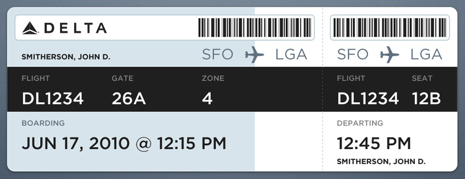
The Delta boarding pass from JFK to SFO makes the most readible sense and is definatelyt he winne here
Tim Bone
Director
Conventions, Events, Corporate Travel
SEIU
OK, I don't have time to read through all the responses, but I used to work for an airline as an IxD and we did a boarding pass redesign while I was there ;-)
First, I noticed all examples show a one segment flight. One of our requirements was the ability to show up to 4 segments on one boarding pass. That pretty quickly eats up space. Second, we had to show 2 different barcodes, one of which would "grow" as the itinerary grew. So we had to leave space for that as well. As others have noted, its very important to show elite status, fare class and the record locator.
Airlines are under a LOT of constraints as far as time and priority. A beautiful BP is a "nice to have" but almost always gets pushed below FAA and TSA requirements for airport ops. So, while we executed a lovely workable design, it still hasn't seen the light of day.
I can't wait to get into graphic design in college.. :)
These were great!
Having flown at least 10 times in the last 3 years, i can say this really is a pain in the butt.
The wallet-sized design made me think: why the hell are boarding passes so big anyway!? I can never carry them with my passport or wallet or ... anything! They're so oddly shaped.
Wow! I never would have thought that something as mundane as a boarding pass could inspire so much thought and creativity. Now, I have to admit that I did not look at every single design featured on your site -- and I have not read anybody's comments, but my pet peeve about boarding passes is that they never show the ARRIVAL TIME OF YOUR FLIGHT AT YOUR DESTINATION PORT. The flight departure time obviously shows up, the "boarding time" is often shown (depending on the carrier) but the arrival time is nowhere to be found. I have to dig for my itinerary to find that out and usually it's when I'm calling my ride at my destination port to let them know of my flight info and arrival time. The typical boarding pass has all the info anybody could want EXCEPT for an arrival time and I find it frustrating having to handle my boarding pass, my cellphone, my carry-on and then have to search for my itinerary just to get my arrival time. If my arrival time appeared on my boarding pass it would be one less piece of crap to have to deal with. Those are my thoughts -- worth what you paid for them!!
Paul