Boarding Pass / Fail
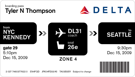
 This is the actual boarding pass I got from Delta. It's a nightmare. Note all the random alignments and spacing issues.
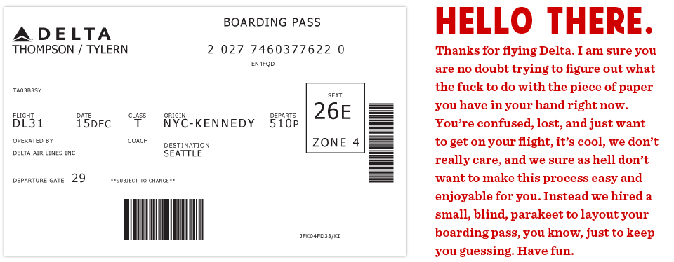
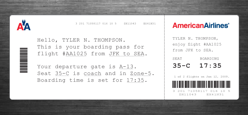
This all started on a recent flight aboard a Delta Airlines plane. I was heading back from New York where I had met up with fellow designer Dustin Curtis. If you are not aware of Dustin's take on American Airlines, go read this. Anyway, I was inspired by Dustin and his attitude towards shittily designed things, to say the least. I was bored so I started rummaging through my stuff trying to find something to read when I grabbed my boarding pass. So I stared at it for a while. Rubbed my eyes, then stared at it some more.
It was like someone put on a blindfold, drank a fifth of whiskey, spun around 100 times, got kicked in the face by a mule (the person who designed this definitely has a mule living with them inside their house) and then just started puking numbers and letters onto the boarding pass at random (yes, I realize that a human didn't lay this out, if a human had, judging by the train-wreck of design, they would have surely used papyrus). There was nothing given size or color importance over anything else, it was a mess.
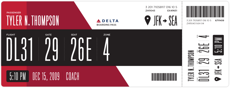
So I took out my Moleskine and started sketching. I tried to remember my previous trip through John F. Kennedy Airport and when and why I needed to reference my boarding pass. It seemed like I first needed to know which flight I was on. I put the gate right next to this, but made the flight number first because gates tend to change quite often. Next came my seat which I always look at a few times while boarding the plane. After that I put the zone, which is how they board the airplane initially and always seemed like the biggest cluster-fuck of people not knowing what zone they were in or how to find it on their pass. I also did something with the time I think might help, when it was a P.M. time, it was white text on a black box and when it was A.M. it was black text on a white box. Below is what I initially came up with.
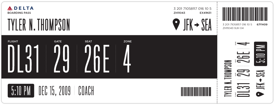
After looking at my initial design for a while I really wanted to add some color. This would be a great way to help add some branding and give some instant visual recognition of which carrier you are on.
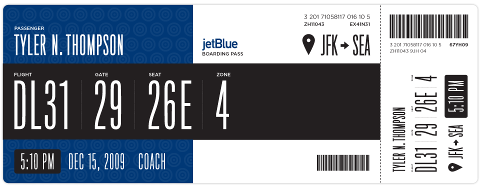
Once I added some branding I thought this layout could work for basically every airline. Below is Jetblue. I haven't researched many other boarding passes, international boarding passes etc. So please feel free to sprinkle the comments with any knowledge, insight etc on the issue.
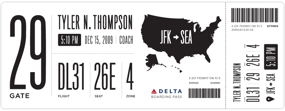
Here is another design I came up with as well.
If anyone has any ideas on how to make this better, please put together a design and email it to me here: t at squarespace dot com. If I get some interesting or good designs, I will update this post with them.
 Tyler Thompson
Here is an Illustrator file template with some of the elements and text, the fonts most likely wont come across unless you have them installed ( Titling Gothic and Gotham Book ) but it should help speed up mocking things up.
Tyler Thompson
A great point was brought up by Samuel about the fact that boarding passes are printed with thermal printers. This would, in effect, ruin the colored designs, although you can print one other color besides black via thermal printers, most commonly red. Here is some more info on thermal printers.
Tyler Thompson
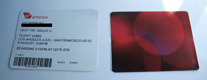
Here is a shot of a Virgin Airlines boarding pass. I would settle for an offset printed backside and a better thought out thermal printed front side.
Tyler Thompson
 Tyler Thompson
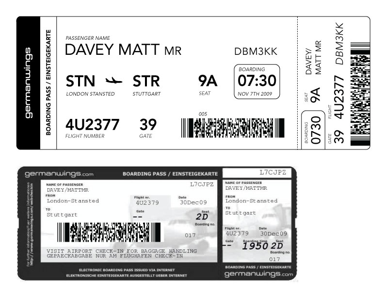
Matt Davey (@mattdavey) gives us our first foreign attempt. Apparently, foreign flights have huge ass barcodes. Nice and straight forward, thanks Matt. It's interesting to note that the foreign pass he shows has knocked out text on black and an image behind it. So either this isn't thermal printed or it is pre-printed then thermal printed.
 Tyler Thompson
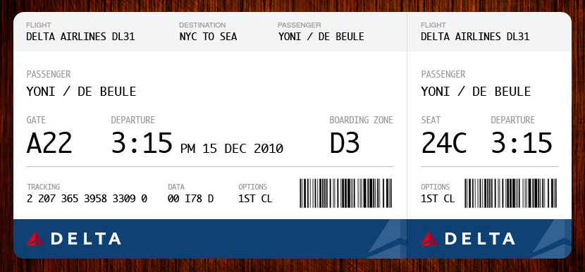
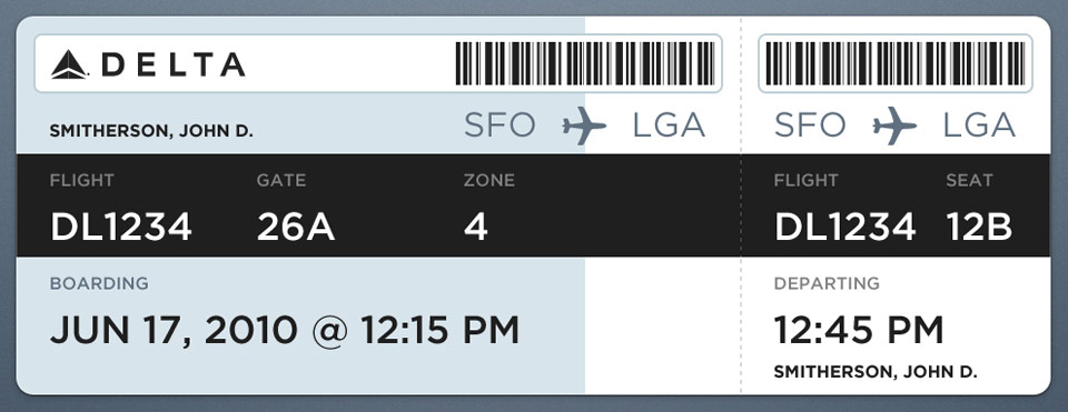
Yoni De Beule has compiled almost every point into this beautiful example. I think I would add the boarding time, but other than that, this looks great.
 Tyler Thompson
 Tyler Thompson
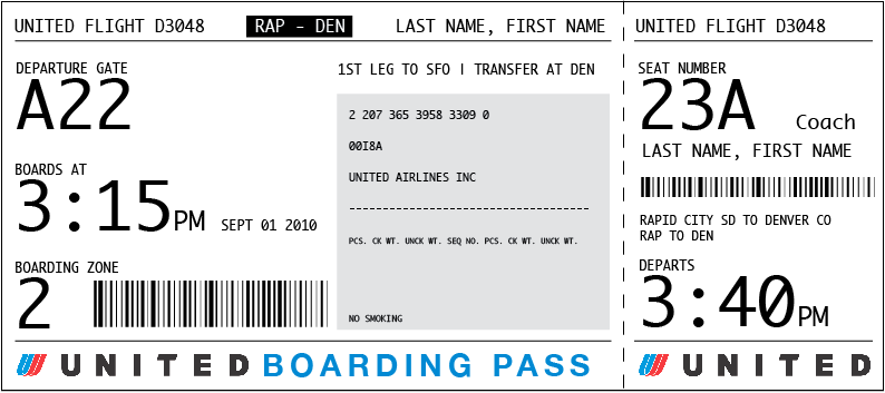
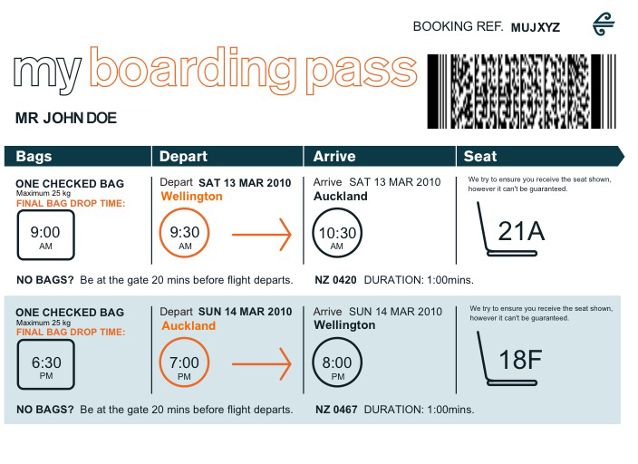
JJ sent this shot of a current Air New Zealand boarding pass.
Tyler Thompson
Great redesign by JJ at Graphicology (Squarespace site!). He takes into account the printing restrictions and adds a human touch. This is a really, really interesting approach.
Tyler Thompson
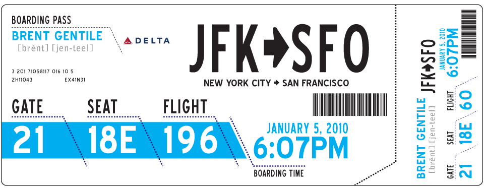
From Brent Gentile. He puts emphasis on the phonetics of your name and the airport codes. I think the phonetics part is important given the rich diversity of most airport travelers.
Tyler Thompson
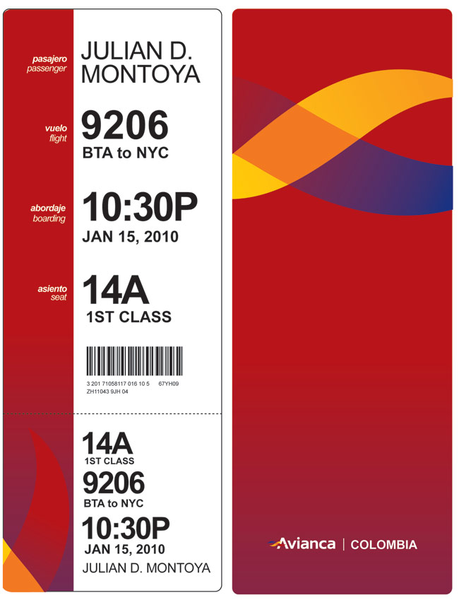
"Hi, I loved your blog about boarding passes, and here is my idea. You know, I think having a "vertical" orientation will give it a lot more clarity, like when you need to know quickly what a book is about, and you start reading from the top certain words. I tried to take the thermal printing into consideration when designing. "
- Julian Montoya
Tyler Thompson
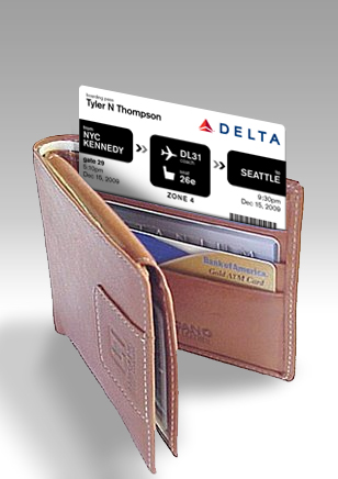
Wallet sized pass from Davin Yoon