

Boarding Pass / Fail
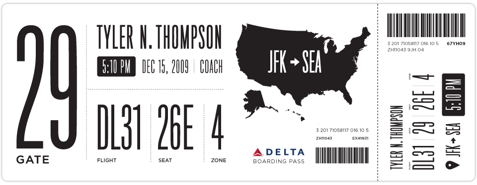
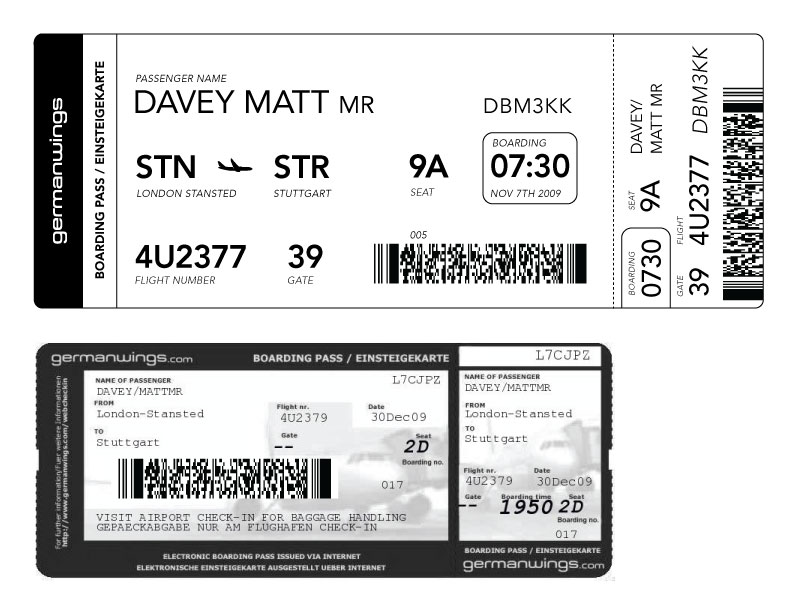
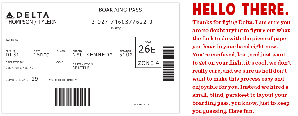 This is the actual boarding pass I got from Delta. It's a nightmare. Note all the random alignments and spacing issues.
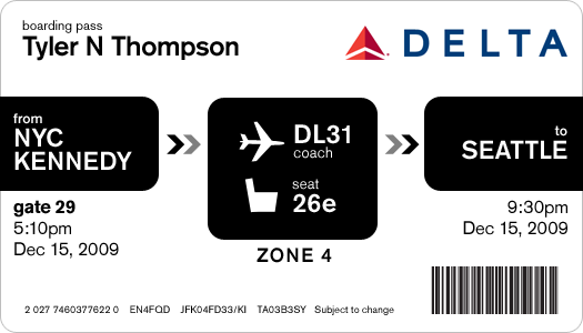
This all started on a recent flight aboard a Delta Airlines plane. I was heading back from New York where I had met up with fellow designer Dustin Curtis. If you are not aware of Dustin's take on American Airlines, go read this. Anyway, I was inspired by Dustin and his attitude towards shittily designed things, to say the least. I was bored so I started rummaging through my stuff trying to find something to read when I grabbed my boarding pass. So I stared at it for a while. Rubbed my eyes, then stared at it some more.
It was like someone put on a blindfold, drank a fifth of whiskey, spun around 100 times, got kicked in the face by a mule (the person who designed this definitely has a mule living with them inside their house) and then just started puking numbers and letters onto the boarding pass at random (yes, I realize that a human didn't lay this out, if a human had, judging by the train-wreck of design, they would have surely used papyrus). There was nothing given size or color importance over anything else, it was a mess.
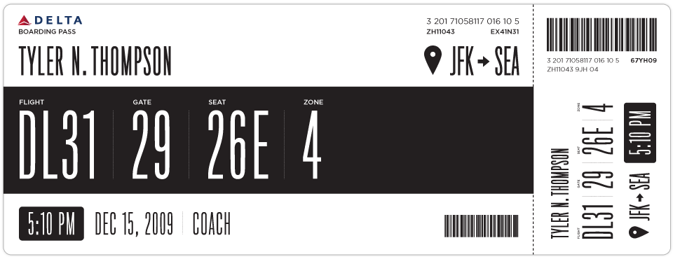
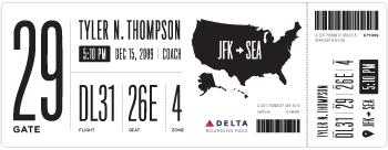
So I took out my Moleskine and started sketching. I tried to remember my previous trip through John F. Kennedy Airport and when and why I needed to reference my boarding pass. It seemed like I first needed to know which flight I was on. I put the gate right next to this, but made the flight number first because gates tend to change quite often. Next came my seat which I always look at a few times while boarding the plane. After that I put the zone, which is how they board the airplane initially and always seemed like the biggest cluster-fuck of people not knowing what zone they were in or how to find it on their pass. I also did something with the time I think might help, when it was a P.M. time, it was white text on a black box and when it was A.M. it was black text on a white box. Below is what I initially came up with.
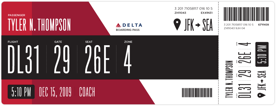
After looking at my initial design for a while I really wanted to add some color. This would be a great way to help add some branding and give some instant visual recognition of which carrier you are on.
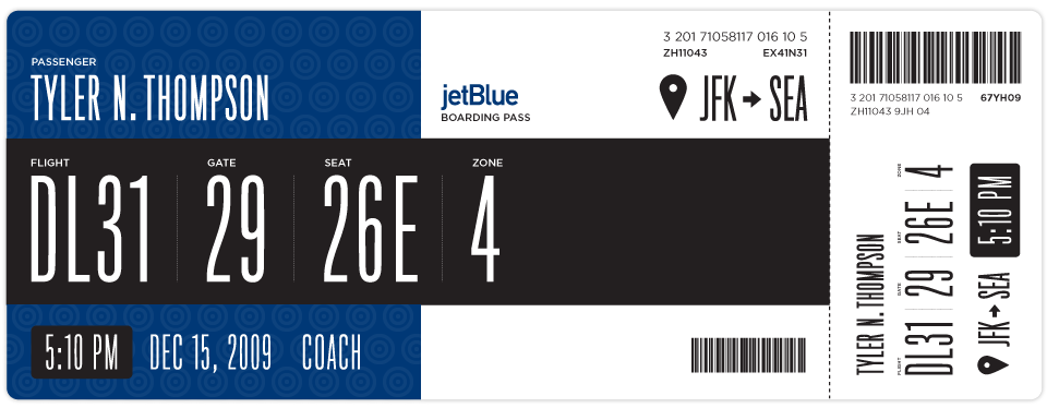
Once I added some branding I thought this layout could work for basically every airline. Below is Jetblue. I haven't researched many other boarding passes, international boarding passes etc. So please feel free to sprinkle the comments with any knowledge, insight etc on the issue.
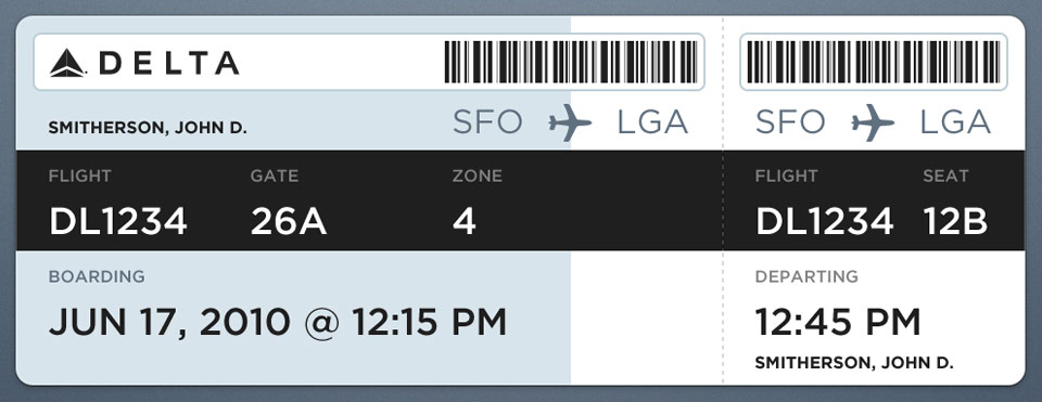
Here is another design I came up with as well.
If anyone has any ideas on how to make this better, please put together a design and email it to me here: t at squarespace dot com. If I get some interesting or good designs, I will update this post with them.
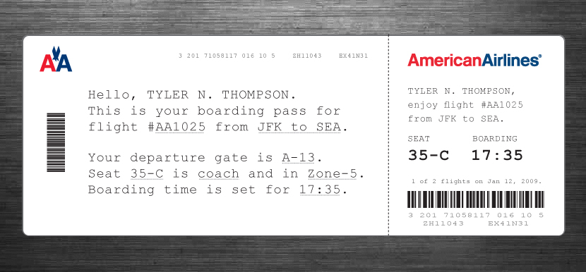
 Tyler Thompson
Here is an Illustrator file template with some of the elements and text, the fonts most likely wont come across unless you have them installed ( Titling Gothic and Gotham Book ) but it should help speed up mocking things up.
Tyler Thompson
A great point was brought up by Samuel about the fact that boarding passes are printed with thermal printers. This would, in effect, ruin the colored designs, although you can print one other color besides black via thermal printers, most commonly red. Here is some more info on thermal printers.
Tyler Thompson
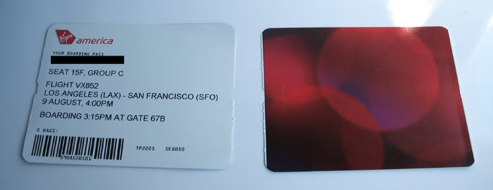
Here is a shot of a Virgin Airlines boarding pass. I would settle for an offset printed backside and a better thought out thermal printed front side.
Tyler Thompson
 Tyler Thompson
Matt Davey (@mattdavey) gives us our first foreign attempt. Apparently, foreign flights have huge ass barcodes. Nice and straight forward, thanks Matt. It's interesting to note that the foreign pass he shows has knocked out text on black and an image behind it. So either this isn't thermal printed or it is pre-printed then thermal printed.
 Tyler Thompson
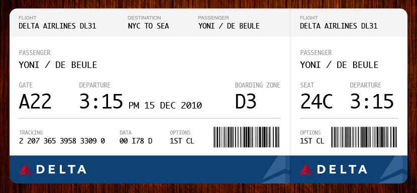
Yoni De Beule has compiled almost every point into this beautiful example. I think I would add the boarding time, but other than that, this looks great.
 Tyler Thompson
 Tyler Thompson
JJ sent this shot of a current Air New Zealand boarding pass.
Tyler Thompson
Great redesign by JJ at Graphicology (Squarespace site!). He takes into account the printing restrictions and adds a human touch. This is a really, really interesting approach.
Tyler Thompson
From Brent Gentile. He puts emphasis on the phonetics of your name and the airport codes. I think the phonetics part is important given the rich diversity of most airport travelers.
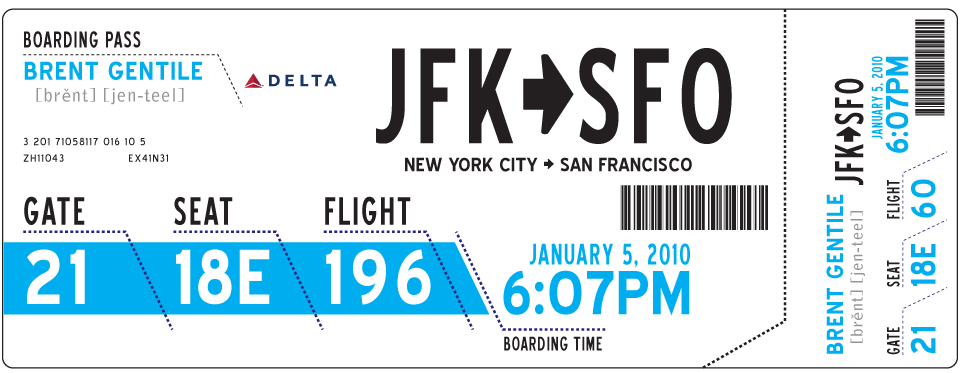
Tyler Thompson
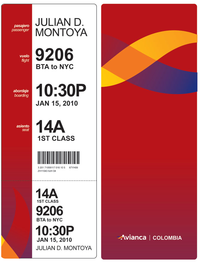
"Hi, I loved your blog about boarding passes, and here is my idea. You know, I think having a "vertical" orientation will give it a lot more clarity, like when you need to know quickly what a book is about, and you start reading from the top certain words. I tried to take the thermal printing into consideration when designing. "
- Julian Montoya
Tyler Thompson
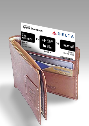
Wallet sized pass from Davin Yoon
Reader Comments (175)
Nice design - Great discussion.
I really see the emphasis is on getting the customer to preprint their boarding pass before getting to the airport. AND it drives me crazy that the design doesn't that into account that it will be printed 8.5 x 11!
Why not brand the UPC stripe, as well? There is no reason the UPC has to be a boring rectangle. For example, it could be formed as a "Delta" icon. I suspect the QR-codes showing up on some stubs cannot be styled in this manner.
Some cool designs, but people overlook the fact that there needs to be some consistency between what the airline issues from a check-in counter, what someone at home prints on their inkjet, what a kiosk prints, and what an interline partner can print from their check-in system.
Also, don't overlook the fact that usability extends beyond the passenger --- don't take it for granted that security folks in Latin America, Middle East or Asia are going to be able to figure out where the information is. There are industry standards today to help keep things consistent and allow security and passport control agents to know where to find the information they need.
The limiting factor is almost always going to be the interline partners or the check-in counter.
This whole post is awesome. I think I'm going to try my hand at a few boarding passes myself.
This was posted on Metafilter, and people there are basically eviscerating you. Cheers.
http://www.metafilter.com/88290/A-Better-Boarding-Pass
The boarding pass should be like those above ^.^
Oh, I really love this personal boarding pass for the AA. Very nice.
Tyler, you should perhaps include the official Delta response in your article?
Your fail is detailed here: http://www.metafilter.com/88290/A-Better-Boarding-Pass#2901116
terrorists took the fun out of travel, your clever designs help to 'defuse' the negativity of getting from your ride to your seat. I love the ability to quickly look at your BP and know what you need to know. Now if I couls only memorize all those airport codes!
I love the concepts. I like the one with the personalized instructions too. That one should also say, "You do not need to do anything at the gate counter unless there is a problem." I can't tell you how many times people have a boarding pass in their hands and go wait in line again at the gate only to hear the gate agent say, "No, you are fine. Just be back here for departure."
as a able in my soccer field, i would recomend this website to come strong grandeur medication, since as you obligated to know, there is a destiny of heavy-hearted calibre websites thither there.
this one i've tested opinion, and i obligated to greetings, it is a high level service and most winning prices over and above the industry.
here is the tie up - [url=http://carisoprodol-oral.com/tag/butalbital]oral side effects[/url]
you can fathom there much more than i can mention: pills oral structure butalbital doctor disease softgel carmol brand
It's interesting that none of these designs include the landing time. I always like to see this time and find myself looking it up again and again since I usually have to plan to have someone pick me up at the airport...
I love the current Alaska Air boarding pass. While designwise is nothing to write home about, it's certainly not ugly, and it's hands down the most usable I've seen in my life. I specially like how you get a single piece of paper for all the legs on your trip.
This is the best picture I was able to find online. I know it kinda sucks. sorry
http://mezzoblue.com/i/articles/2008/nov/boarding.jpg
I'm not a designer; I am however a frequent flyer, having travelled on planes since I was a baby.
Asian boarding passes tend to have a standard coloured layout, followed by the details thermally printed. The thermal printing would mess the white-on-black ideas, since those would smudge pretty badly.
What I would like to see on a boarding pass:
* What terminal the gate is in - I've been on so many flights where the terminals change. I wonder if this can be standardised.
* The information about the baggage being printed on the card instead of being on separate tags (is that even possible?)\
* The stub we carry should predominantly have info about our seat (we're already in the plane by the time we get that stub), any meals we order, any special amenities/information they need to know, and information about what class we're in (first, business, economy, etc). If there's a provision for lounge entry that should be on the pass too. Info about inflight services would be handy for budget airlines where you need to pay for each separate thing and the flight attendants check your boarding pass for that info (eg Air Asia, which uses stickers on receipts).
* A symbol to denote special needs (a wheelchair, young person travelling alone, etc)
* A picture of the seat - well, rather, symbols noting whether it's an aisle or window or mid seat, and where in the plane it is. They can change your seat on checkin so it shouldn't be hard to get this info
* Your frequent flyer number, I keep losing this! Also how many miles you earn on this flight
* Contact numbers - yours, the airline's, the airport's
* How long the flight is, and the time differences
The pronunciation thing is useless - a lot of flyers wouldn't know phonics and the people who will say your name aren't going to read them. Not every airport/airline does zone boarding.
I remember dot-matrix-red boarding passes that were multiple pages long, had carbon copies, and told you your rights as a flyer as well as the baggage you couldn't carry. I kinda miss those ones actually, they look a lot more interesting!
cool idea, be nice if they fixed their actual in-flight experience at the same time......no amount of ticket beauty is going to make up for being crammed in a tin can being served bad food and bad coffee...... :)
hey Tyler,
A designer I am not...IT is my background. but a friend forwarded my your link and I found it pretty interesting. Just thought I could add a little perspective to your thought-provoking exercise. Here's my somewhat educated guess: The format that boarding passes take on paper is almost certainly a relic of the computer system capability of the era in which they originated---function trumped form, because basically there were no options for form. 30 or more years ago, everything was text-based output on dumb terminals tied to big mainframe systems. Even though time (and computing power) progressed such that form could be quickly and easily manipulated, priority was given to making replacement systems based on Windows PCs backward compatible with the existing terminals (function continued to be dominant). And since the airlines all share (and interface into) a common ticketing and reservation network, they all have to use a common format. And since the airline business is a perpetual money-loser (regardless of what Wall Street or company execs would have you believe), none of them have any real incentive to invest time and money in redesigning a boarding pass because doing so doesn't save any money or generate any new revenue.
Hello!,
Looks nice! However, and going against some of the comments here, you put all the attention to the Gate number, which is actually an information that might (and more often than you think) change. So it's good to have it vissible in the boarding pass, but actually it is just informative.
Passengers (I actually do and never look that information in the BP) should read the screen to check the actual gate number. Thus, doesn't make sense to write it so big and as it were the center of attention of the BP.
Beautiful redesigns Tyler! If I may ask, what typeface is in use here?
The current boarding passes make sense and does it really matter so long as you can tell where you are supposed to be and at what time. All that crazy info and stupid bar codes are mainly for the airlines, yes event he random letters on there have a meaning and make sense. The airlines do not print in color or make them look good because 1) they don't have to 2) to save money.
Get the fuck over and stop complaining.
I like the first redesign approach the most - its clear, concise, very intuitive and presents all of the essential data. Great job! Its extremely sad how little emphases is paid to user experience in public spaces around us.
I also like your first approach very much. This project speaks for a very passionate designer, taking and improving random things you find out there :)
Great blog, and what great ideas! I especially like JJ's "human" approach. For those of you who complain about language or international clock restrictions, bear in mind that these can always be changed country-to-country via simple formatting. Besides, I always have to fly American, and believe me - any change for them is a change for the better.
Very nice designs. It would definitely add some unexpected flair to what is otherwise a mindless affair. As an air traffic controller though, I should point out that perhaps putting too much attention on the gate number isn't important. Certainly it will most likely be accurate for the first flight, but gate assignment is a rather fluid mechanic of airports. Many times flight crews won't even know their gate until they have landed and are entering the ramp.
They are good except why why why AM/PM. All travel should use 24:00 clock to eliminate any chance of confusion
The designs are great, and can be applied to the carrier's online/self-service check-in applications.
Unfortunately, AEA technical specs does not support the technology that will make the designs possible. @timoni's suggestions would be practically the most that we can do about the design.
Until such time that AEA revamps its airport printer technical specs to take into account the advances in hardware, we're stuck with those stubborn boarding passes and tickets that our carriers hand over in airports.
Actually, airport common-use system platform vendors (such as SITA and ARINC) which are in control of the hardware being used in most airports in Europe and Asia are the suspects... No significant innovation on airport ticket printers have been made since they rolled-out thermal printers.
@leypascua
All efforts are very nice, smart and beautiful - but remebmer that those tickets are printed using a simple printer dealing with huge variable data - so, some of those layouts wouldn't be possible, due to impossibility to print in white over a black or color-pattern background.
Tyler,
About the original Delta pass @
Being older than mostly anybody else, I'm able to understand this design.
It´s all about a printer.
I sports printed lines, all with charecters of the same size.
The first line might be "BOARDING PASS" or "2 027 7460 ..." the pass number.
The next line es "DL31 ..."
Two more lines start with "SEATTLE" and "29".
Notice that everything is printed in uppercase letters, denoting an old printer with small characters set, maybe 48.
Everything else was preprinted.
And the passes might have been printed in a big batch by a line printer in Delta's headquarters.
The "SEAT" box was obviously added after, maybe it was in the initial design but was filled by hand hence it´s special size.
I thought this was a great, is there any chance it's actually gonna happen. I would be so excited to get my boarding pass if this did happen.
I'm so glad that Nelson, Spl76, and Ross are on top of the situation and can affirm for us that the current boarding passes work as well as anyone can expect a boarding pass to work.
So the crowds of people in my way as I raced for my flights at four different airports over the holidays, the throngs clustered around terminal banks, puzzedly looking back and forth between boarding pass and screen as they tried to be sure they had the right flight and gate, could be no smaller.
And the people who stopped suddenly in front of me to squint at their boarding passes for the gate, flight number, or boarding time and blocked my progress through the concourses? It wasn't the design of the boarding pass that kept them from being able to read that information at a glance. It's their own fault for being hurried, harried, unaware, dimwitted, and, well, just plain stupid.
And all the people who stood there at the gate as our boarding times were announced, with no clue that, to speed up boarding, they should get out of my way? They should have known by the look on my face that I was in the group ahead of theirs.
Come to think of it, maybe I'm the one who's just plain stupid for expecting a document that people need to refer to repeatedly while hurrying through security, down concourses, and onto planes to be easy to read while walking quickly, hefting a carry-on, and juggling personal items.
Tyler, thanks for starting this discussion. I look forward to a much better traveling experience soon.
Well, at least from the curb to the plane.
I used to work at Air New Zealand, and did some early work on the boarding pass design, it was a really interested project.
As a side note, for domestic flights in New Zealand, you can download an iphone app, or a java based app for non-iphones that takes the place of a paper boarding pass.
When you get to the gate, the screen on your phone is scanned, and a document is printed with your seat number (which is shown to air crew when you are boarding).
It's a great system that takes the worry out of having an extra bit of paper to carry around and look after when you're flying.
What a splendid idea. I've seen people - even accomplished travelers get themselves knotted up trying to figure out boarding passes. A couple of thoughts for you. When used internationally, boarding passes are almost always used in conjunction with a passport. I'd suggest this should imply a useful relationship between the form factor of a passport (which is fairly standard) and the boarding pass. I like to tuck the boarding pass inside my passport to be sure I have everything together and many boarding passes stick out most awkwardly. Second thought (and I think there are several designs above that work beautifully for this) it should be legible to the colorblind and you should not need reading glasses to pick out the important parts of the pass. And just one more thought. Some of us are very used to the pathetic designs out there - we're used to trying to parse dopey designs. It might be nice if the design took into account the regular fliers.
Interesting post and I think that the initial design that you came up with solves some of the gripe that I have with boarding passes: There is a lot of information in "encoded" form and it is hard to get an immediate overview of "what's what". Your design beautifully "collapses" all that information in the centre of the boarding pass, allowing my eyes/brain to scan all of these codes and decide which are important to me at the current time (if I have a long wait, it is probably the boarding time, if I am late for the gate, it is the gate number, if I am boarding, it is the seat number).
Traditional boarding passes (including Timoni Grone's, Matt Davey's and Yoni De Beule's) suffer from spreading all this information all across the boarding pass, forcing me to try to scan the entire pass to find the relevant information.
I also like JJ's for the simple reason that I don't think there is any good way to structure the information (the main reason I like the original redesign is that there is no attempt at structuring the data -- it is just there in the middle in huge type). Since the data does not structure well, you might as well turn it into prose as JJ did...
Clearly if you can't understand what a flight ticket means, LEARN! it's not that hard or difficult. Jebus!
Nice idea. Boarding passes are not known to be good design. Stupid really as it is excellent advertising / branding real estate going to waste. Much like shop receipts. Which are also wasted when it comes to good design.
One issue I have with some of these is the layout of information. For example, on the one from Yoni De Beule, he has on the large portion the Gate followed by the time:
A22 3:15PM
Then on the smaller portion, he groups the Seat with the time:
24C 3:15PM
This would be easy to get confused, and head to seat 22A instead of 24C.
On another note, I think the emphasis on the Gate number on many of these is misplaced. As a frequent flier, I've noticed that my gate number is almost never what's printed on the boarding pass. As an alternative, the most emphasized info on the large portion should be the Flight number, and on the smaller portion, the seat.
Also, one final non-design nit-pick: on your example, you didn't change the flight number when you changed to JetBlue. JetBlue flight numbers are preceded by "B6", not "DL"
I have to admit that I keep preferring the original version
this post pretty much made my day, what an exceptional idea. i hope some corporate executive sees this and has some kind of ephiphany about the importance of design. My favorite has to be the one with the human touch. it would be very refreshing to have all the important information in one easy to read paragraph. genius.
I think these all look great, a smart airline would take these ideas and run with them. People have enough stress when flying, no need for confusing boarding passes to further complicate things.
I think that: Matt Davey, Yoni De Beule and Julian Montoya did a good job.
The rest of the designs: no comment!
Know i'm a little late to the party, but fantastic idea, and as a point of reference that it's completely doable to make these more readable, Apple's retail stores deliberately designed their receipts to convey information easily and beautifully, and they too print on a regular thermal roll.
I agree with Aaron. I had no trouble reading your boarding pass...I understood it completely though I've never in my life stepped foot on a plane. Your designs are much prettier, of course. But the original tells the customer exactly what s/he needs to know. I can't say that I know what orders the numbers should be in, but I assume everyone else here would know what's more convenient. Otherwise, I see nothing wrong with an ugly boarding pass. Should I ever need to fly, my choice of airline will not lay very heavily on what the passes look like. But good job, anyway. As I said, they are all very pretty designs.
What the boarding pass is missing is a grid of equidistant dots just visible to the eye to tie it all together. The spacing needs to be just right to hit the average eye's blind spot and really drive them nuts
Inspirational designs, I'll try to keep my boarding passes when I fly off to Hong Kong next week :D
As a graphic designer at Delta my comments would be. "Don't you think we would design a better boarding pas if the hardware that prints the info was capable of anything but ugly text???" I would suggest that anyone who thinks they can do a better job, get out of your mommie's basement and go get a job. A lot of priorities at an airline before replacing pass printers.
While I like the design of most of them, I'm not entirely sure they are the most "user friendly" for example we know that a combination of upper and lowercase characters increases legibility. You have already noted the font issue though.
I think that while travelers are the end-users of boarding passes, they are not the only users. Ticket agents use them, security personnel check them, flight attendants check them. It might be useful to include a small place for agents to write notes or check boxes for security personnel to check that the person has gone through inspection.
I applaud your efforts. Hopefully someone at an airline is watching.
It is rather interesting for me to read the article. Thanx for it. I like such topics and everything that is connected to this matter. I would like to read a bit more soon.
love the new options
I lol'd at the guy that said he'd fly more if these were the boarding passes. Yeah ok.
And I agree with the people that take ink production into consideration. These are pretty, sure, but serve absolutely zero purpose. I had no trouble reading the original pass layout and the only thing that left me wanting to scratch my eyes out was trying to figure out what was so wrong with it in the first place.
It's simple, it SHOULD be simple. Especially when the only airline making any money is Southwest.
Nice idea ,given that we will all be getting strip searched in future may I suggest some pictures of 72 virgins on the pass,that way if we get a twitcher when he looks at it we can redirect him back onto AirJihad,special rendition flight courtesy of the CIA